When we first started WPBeginner, mobile-friendliness wasn’t even on our radar. Most people browsed the web on desktop computers back then. Smartphones weren’t as common as they are today.
But wow, have things changed! 📱
These days, more than half of all web traffic comes from mobile devices. Many WPBeginner users learned tough lessons when their non-mobile-friendly sites started losing traffic. We don’t want you to make the same mistakes.
That’s why we’ve created this guide to making your WordPress site mobile-friendly. We’ve tested these 13 strategies on hundreds of WordPress sites.
Don’t worry if you’re not tech-savvy, as these tips are easy to follow. You won’t need to hire expensive developers or learn complex code.
💡 Quick Answer: How to Create a Mobile-Friendly WordPress Site
Here are the top tips to create a mobile-friendly WordPress site:
- Start by checking your site’s mobile score.
- Install a responsive WordPress theme.
- Optimize all your forms with WPForms.
- Prioritize website speed.
- Make content easy to read.
- Use clear navigation menus.
Why Make Your WordPress Website Mobile-Friendly?
Making your WordPress site mobile-friendly means your visitors can read and browse comfortably on any device, especially mobile phones and tablets. It also helps your site show up higher in search results and keeps people coming back.
Mobile optimization should be a no-brainer WordPress design choice, but not everyone realizes this.
Each year, more people are turning to their smartphones for searches. In fact, a significant portion of all web traffic worldwide now comes from mobile devices, and mobile search is even more popular in Asia and Africa.
Google uses mobile-first indexing, meaning that its web crawlers prioritize indexing the mobile version of your website’s content over the desktop one.
So, if you have a perfect desktop version of your site but fail to optimize for mobile, then your search rankings will be negatively impacted.
And with most people spending up to 6 hours on their phones every day, your business will have a lot of opportunities to catch visitors’ attention.
Working to capture some of that screen time can lead to other benefits as well, like:
- More purchases: Consumers are significantly more likely to buy from mobile-friendly sites, making it especially important for product-based sites with online stores.
- More impressions: Since most online searches now happen on phones, having a mobile-friendly site means you can reach a much larger audience. This helps more people discover your brand.
- Increased dwell time: Dwell time is how long users are spending on your website. Capturing their attention will help to increase the time they spend reading your WordPress blog or checking out your products and services.
But what does a mobile-friendly website actually mean?
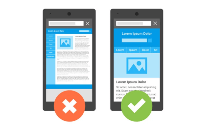
A mobile-friendly website means your content fits perfectly on any screen size. That way, visitors can easily navigate and access all the elements on the page without having to zoom in or out.
Now, let’s dig into our tips on the most effective ways to create a mobile-friendly WordPress website. Feel free to use the links below to jump to any part of the article:
- Check If Your Site Is Mobile-Friendly in the First Place
- Use a Mobile-Friendly WordPress Theme
- Hire a WordPress Agency to Redesign Your Website
- Create Mobile-Friendly Forms
- Prioritize Your Website Speed
- Optimize for Mobile SERPs
- Optimize for Local Search
- Use a Mobile-Responsive Navigation Menu
- Make Your Landing Pages Mobile-Responsive
- Use Large and Readable Font Sizes
- Don't Add Large Chunks of Text
- Change Your CTA Button Placement and Size
- Make Important Information Easy to Find
- Frequently Asked Questions About Mobile-Friendly Websites
1. Check If Your Site Is Mobile-Friendly in the First Place
Before you can make any improvements, it’s a good idea to know whether your site actually meets search engine standards and adapts well to mobile screens.
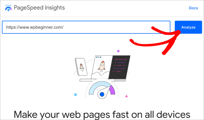
The best way to check your site’s mobile performance is to use Google’s PageSpeed Insights tool. It analyzes your web pages and gives a score for mobile and desktop, along with suggestions on how to improve your speed and user experience.
To check if your site’s layout is truly responsive, you can also use your browser’s developer tools or Google Search Console’s Mobile Usability report.
Note: If you want to see what the mobile version of your site looks like, you can check out our article on how to view the mobile version of WordPress sites from desktop.
To get started, open the tool, enter your website URL, and then click ‘Analyze.’
You will notice two tabs: Mobile and Desktop.
Click on the ‘Mobile’ report to see your Core Web Vitals Assessment.
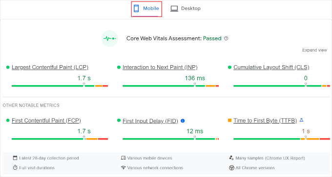
In short, the Core Web Vitals are metrics that measure your site’s speed, interactivity, and visual stability. You can think of them like a ‘report card’ from Google that grades how user-friendly your site is in the real world.
Google has even incorporated the Core Web Vitals as ranking factors for SEO, meaning it’s important to get a good grade if you want to rank higher in the search results.
Understanding Core Web Vitals
| Metric | Measures | What it means |
|---|---|---|
| LCP (Largest Contentful Paint) | Loading performance (how quickly the largest content element on the page becomes visible). | A fast LCP ensures users see the main content quickly on mobile, reducing frustration and bounces. |
| FID (First Input Delay) | Interactivity (how quickly the site responds to the first user interaction, like a tap or click). | A low FID means your mobile site feels responsive, making interactions smooth and enjoyable. |
| CLS (Cumulative Layout Shift) | Visual stability (how much unexpected layout shift occurs during page loading). | A low CLS prevents annoying content shifts on mobile, ensuring a stable and user-friendly experience. |
Next, scroll down to ‘Diagnose performance issues’ to view your mobile performance score.
Basically, you want a performance score between 90 and 100 to ensure a fast and smooth experience for mobile users.
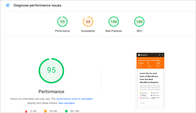
The good news is that PageSpeed Insights will offer suggestions to improve that score.
If you scroll down to ‘Diagnostics,’ you will find some areas of improvement. Under each item, you can hit the dropdown arrow to get a detailed look at what specific element or area they are referencing.
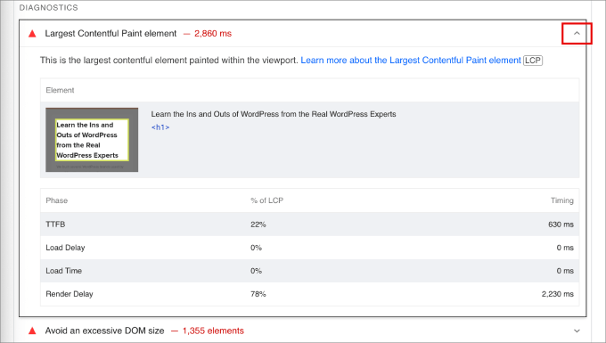
In this context, we can see that the element used here takes too long to load, so we will need to optimize the image by reducing the file size or replacing it with something else.
Since the report can get complicated quickly, you will probably want to search our blog to see if we’ve covered that topic.
That said, most of your mobile-friendliness issues should be resolved if you follow the rest of this guide.
2. Use a Mobile-Friendly WordPress Theme
In our experience, the fastest way to make WordPress mobile-friendly is to choose a responsive WordPress theme.
Many of the most popular and best WordPress themes are mobile-ready, so they will adapt to your mobile device automatically. They do this by using media queries to adapt to different screen resolutions seamlessly.
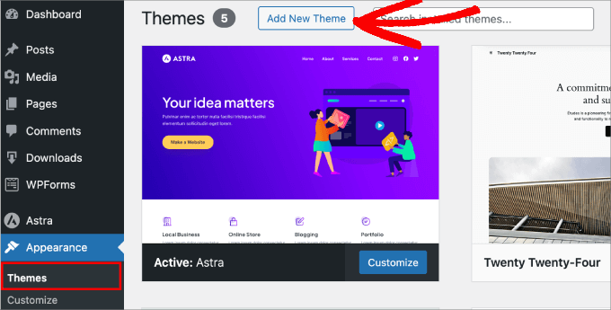
You can find a mobile-responsive theme by heading to Appearance » Themes in your WordPress dashboard. Then, just click ‘Add New Theme’.
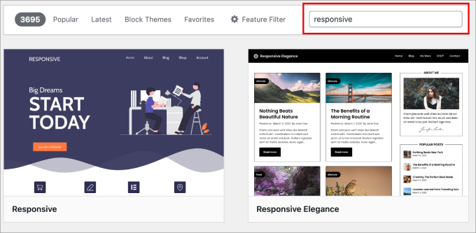
In the search box, you need to type in ‘Responsive.’
This should give you an entire list of free, responsive WordPress themes that you can install immediately.
That being said, paid WordPress themes usually offer the most customization options to give you a more functional and visually appealing website. Check out our guide on free vs premium WordPress themes to learn more about the differences.
If you want higher-quality themes, then our top recommendation is SeedProd. This plugin is a powerful drag-and-drop website builder that also lets you create custom WordPress themes.
Out of all the theme builders we’ve tried, SeedProd is the easiest to use on the market. It lets you create custom WordPress themes without hiring a developer or writing a single line of code.
Rather than installing a lot of theme .zip files, all you need to do is install the SeedProd plugin and start building your theme inside WordPress.
Note: There’s also a free version of SeedProd that allows you to test the plugin with limited features to see if it’s a good fit for you.
SeedProd comes with over 300 templates, so you’ll most likely find something that suits your preferences and use case.
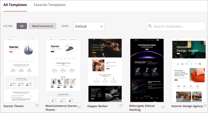
You can easily get started by selecting a premade starter theme template.
Then, you can build each page of your theme one at a time.
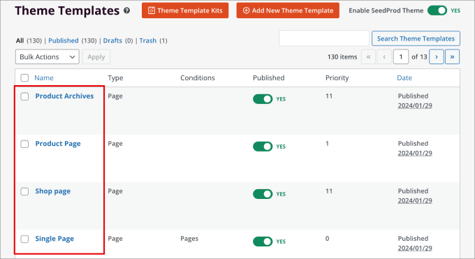
From there, you can personalize each section of your site using the visual drag-and-drop editor. Just point and click on elements to add to build stunning layouts and view the changes that occur in real-time.
The entire theme is mobile-responsive, meaning every element you add, such as rotating testimonials and countdown timers, will fit on a mobile screen.
On top of that, inside the theme builder, you can preview mobile designs and make changes only to the mobile version of your site.
For more details, you can see our tutorial on how to create a custom WordPress theme.
You can also check out our Elementor vs Divi vs SeedProd review to see how the theme builder compares against other, more popular options.
3. Hire a WordPress Agency to Redesign Your Website
Maybe you’ve searched everywhere for the right mobile-friendly design, but it still doesn’t meet your standards. Or you don’t want to spend time to spend learning how to use a page builder.
In that case, we recommend hiring a professional WordPress development agency to redesign your website.
While hiring a professional comes at a higher upfront cost, it’s a worthy investment because:
- You get a custom-designed, mobile-friendly website that perfectly reflects your brand.
- It saves you the time and frustration of trying to do it yourself.
- You benefit from expert knowledge of WordPress best practices and current web standards.
- Your site will be optimized for speed, SEO, and user experience from the start.
If you need recommendations, then check out our picks of the best WordPress development agencies you can hire.
4. Create Mobile-Friendly Forms
There’s a good chance that you have a handful of forms on your website, such as newsletter signup forms, contact forms, surveys, payment forms, user registration forms, conversational forms, and more.
Forms allow visitors to contact you and connect with you, which is why you need mobile-responsive forms that automatically adjust to any device.
Our top choice for the best contact form plugin for WordPress is WPForms.
We’ve used this form plugin for years, and all forms created with it have always been completely mobile-friendly. Whether your visitors view your website on a laptop, desktop, smartphone, or tablet, your forms will always look great.
Plus, all the form templates are designed for cross-browser compatibility, meaning your website will work on all modern browsers.
WPForms automatically makes your forms mobile-friendly, adjusting them to any device.
For example, if you create a multi-page form, the plugin ensures all elements and fields fit neatly on a mobile screen, preventing too much information from being stuffed onto one page.
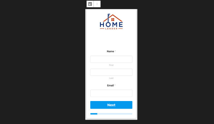
Best of all, you won’t have to write code and can easily customize your forms through an easy-to-use drag-and-drop builder.
For more details, you can see our complete WPForms review.
Keep Optin and Contact Forms Short
Filling out forms on a regular desktop computer isn’t a big deal. But on mobile sites, long and complicated forms can be really tough to finish.
You will want to check your forms and think about whether you really need all the fields.
For instance, consider an opt-in form for accessing free WordPress training. It should explain the main benefits quickly and only ask for essential information like the visitor’s name and email address.

For forms turning users into customers, you don’t need to know things like their favorite color. Just get their billing info and shipping address.
A lengthy and complicated checkout process often makes people abandon their shopping carts. So, if you want to stop that from happening, make your mobile forms simpler.
5. Prioritize Your Website Speed
Optimizing your page load speed is a vital part of mobile SEO. Google takes into account your page loading time as a ranking factor, meaning that websites with slow speeds will rank lower.
You can use any online speed test tool, like Pingdom, to easily find out how fast your webpages load.
This software even allows you to set the specific location so you can check the page speed in your audience’s country.
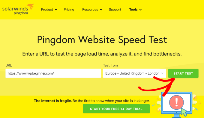
Just enter your URL and choose your destination. Then hit ‘Start Test,’ and you’ll see your results below.
You will want to make sure your page load time is between 0.5 and 2 seconds.
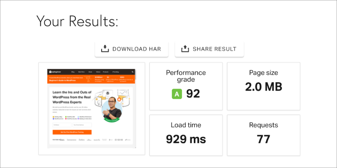
Google’s research suggests that even a 3-second delay can cause over half of website visitors to abandon your site. And as load times increase, so does your bounce rate.
Our rule of thumb to keep your site as fast as possible is to simplify your web design. But if you’ve followed the steps above, you shouldn’t have too many issues.
A few other things you can do to increase your website speed include:
- Resize and compress heavy images
- Use a content delivery network (CDN)
- Lazy load your images
- Keep WordPress up-to-date
- Minify your website code
- Optimize background processes
If you want to maximize your site speed, check out our ultimate guide to boost WordPress speed & performance.
Choose a Fast Hosting Provider
The easiest way to improve speed is by choosing the fastest WordPress hosting. That’s because mobile users typically have slower internet connections than desktop users. If your hosting is slow, it will only increase the time it takes for your web pages to load on mobile devices.
We’ve run performance tests on many popular WordPress hosting providers and found SiteGround to be one of the fastest options available. In fact, we’ve used SiteGround for various projects include WPBeginner, and they offer excellent performance.
Best of all, they offer our WPBeginner readers a huge 81% discount on hosting, plus a free domain name.
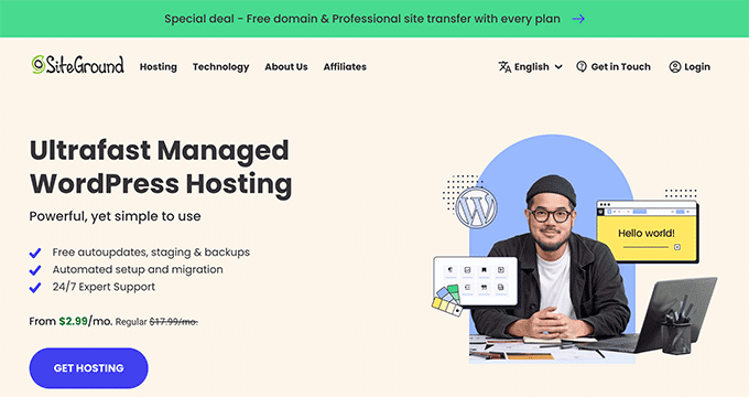
For more details, you can see our guide on why we use SiteGround on WPBeginner.
Alternatively, Hostinger is another great option if you are looking for more affordable but still fast WordPress hosting. They also offer our readers a huge discount, plus a free domain name.
6. Optimize for Mobile SERPs
Mobile search engine results pages (SERPs) differ from desktop versions. When browsing a chosen keyword, it’s important to check for both mobile and desktop results.
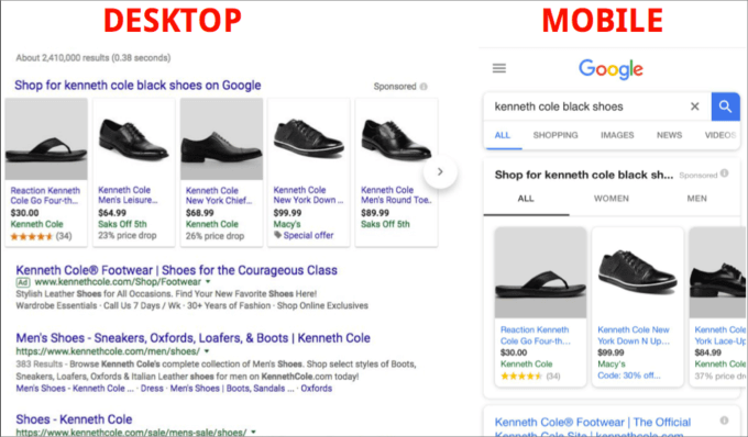
Also, rich snippets on mobile look different than those on desktop.
For the desktop search, you might see pretty standard results with the title tag and meta description.

However, in the mobile results, Google often enhances the preview text with additional elements like how-to images or direct answer boxes.
This makes the search result more engaging and likely to be clicked on.

Getting these rich featured snippets is highly important to helping your articles stand out from the crowd.
To optimize your mobile search and give your best chance of winning rich snippets for your pages, you will need to add schema markup. This organizes content so that Google can easily understand and display it.
It can add things like reviews, frequently asked questions, recipe stars, and other elements to your results in the SERPs.
In our experience, the easiest way to add schema markup is to use an SEO plugin like All in One SEO. Otherwise, you usually need to know some code to enable the schema functionality.
With AIOSEO, you have access to plenty of Schema Catalog options to fit your specific page type. For example, if you want to rank your recipe blog post, you can select recipe schema.
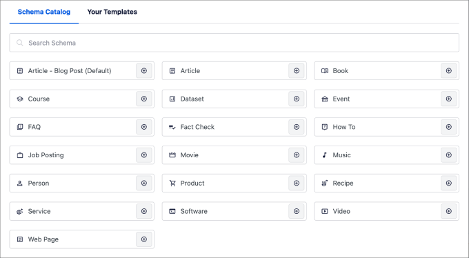
For a more in-depth guide, check out our full tutorial on how to add schema markup in WordPress and WooCommerce.
7. Optimize for Local Search
A huge part of the popularity of mobile search revolves around local search. In fact, one-third of internet users are searching for local businesses a few times a week.
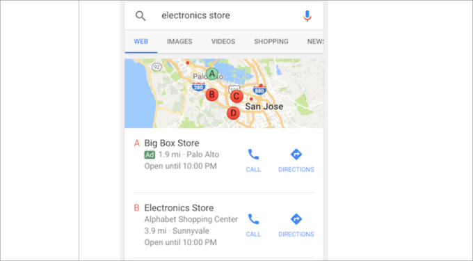
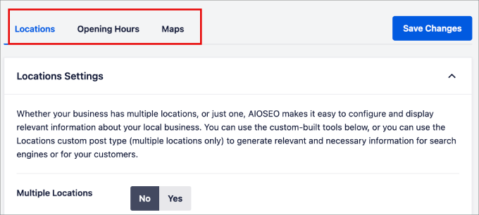
There are plenty of ways to prioritize local results in SERPs. But for starters, you can take advantage of All in One SEO’s Local SEO feature.
Here, you can add all the locations for your business and opening hours. Then AIOSEO does all the hard work for you, and properly organizes the HTML code in a structured data format so that search engines can display that information to potential customers.
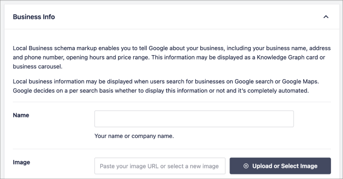
On top of that, you can add all the business info that customers should know about.
This includes the company name, business address, contact info, payment info, and so on.
8. Use a Mobile-Responsive Navigation Menu
One of the biggest mistakes we have seen with website owners using heatmap tools is that visitors have trouble clicking on buttons on their mobile devices.
That’s easily fixable when you create responsive navigation menus.
On mobile screens, you may want to avoid intermediate pages and reduce the number of options.
For example, a good mobile navigation menu will pop open cleanly on the screen, ensuring you don’t have to zoom in, and the buttons are easily visible and tappable for mobile users.
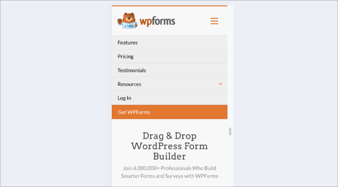
Most modern WordPress themes will provide responsive menus out of the box. However, if they don’t, then you can use a plugin such as Responsive Menu to add them to your site.
For more details on how to do this, check out our guide on how to create a mobile-ready responsive WordPress menu.
9. Make Your Landing Pages Mobile-Responsive
A lot of website owners use third-party tools or plugins to make landing pages in WordPress. This is great for boosting conversions, but it’s very important that your pages work well on mobile devices.
So, you will want to make sure to use a WordPress page builder that includes mobile-friendly settings.
If you use SeedProd, you won’t have to worry about responsiveness. This page builder plugin has a huge library of mobile-friendly templates you can use with just one click. After that, you can customize your page easily using the visual page builder.
SeedProd’s landing page settings also let you switch between the desktop and mobile versions easily. This means you can perfect your design all in the same place.
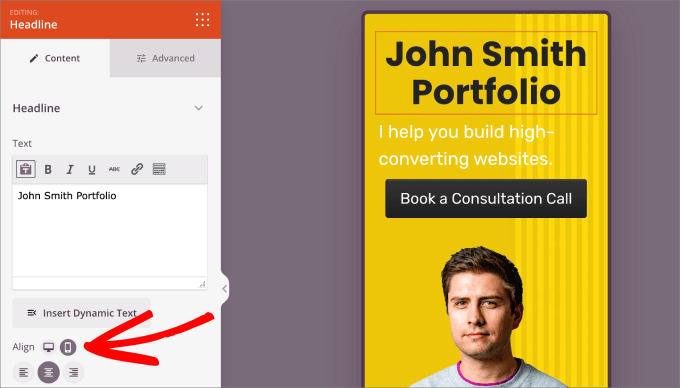
Finally, when you are ready to publish your page, you can preview it on the live mobile preview screen and make any adjustments you need.
For more details, just see our guide on how to create a landing page with WordPress.
10. Avoid Intrusive Popups
Popups that are distracting and intrusive are frustrating for visitors. They can be even more irritating for mobile users because they take up a bigger portion of the screen.
You will often find that large pop-ups will lower conversion rates, and you will get a thumbs-down from Google as well.
As part of Google’s long list of ranking signals, they approve more subtle popups compared to larger and more intrusive ones.
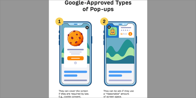
We recommend using OptinMonster, which is the best popup plugin that allows you to create beautiful and mobile-friendly interstitials. It’s what we use to run our sales and event campaigns on all of our business websites.
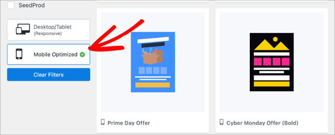
OptinMonster comes with 75+ expertly designed templates, and you can filter them by ‘Mobile Optimized’ to get popups that fit the mobile screen and are unobtrusive.
For a full tutorial, just read our guide on how to create mobile popups that convert (without hurting SEO).
11. Make Your Content Mobile-Friendly
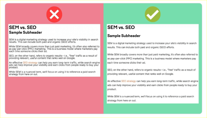
Big blocks of text are hard to read on small screens and can make your site seem cluttered.
Mobile users prefer quick and easy-to-read info, so long paragraphs can be overwhelming.
That’s why when you are building your website, you will want to break text into small, readable paragraphs.
For instance, use headings and subheadings to help readers find what they need.
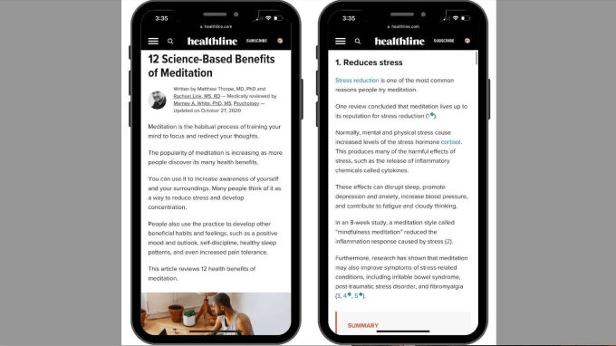
For instance, many popular health websites use short paragraphs and clear headings to make their articles more skimmable. It’s best to avoid paragraphs with more than 4 or 5 lines since they will appear even longer on mobile.
Beyond that, you can follow these tips as well:
- Create a visual hierarchy. Add headers to highlight main points. For website copy, you can use headers and short descriptions for each block.
- Stick to one idea per text block. Avoid long text on your homepage or blog. Keep paragraphs short and use headers to separate content in blog posts.
- Use white space and negative spacing. White space prevents clutter and can improve comprehension by up to 20%.
While these are small changes, they can make a huge difference in whether your visitors stay or leave.
You can see our guide on how to add and improve readability score in WordPress for more tips on improving readability.
12. Change Your CTA Button Placement and Size
When creating your home page or a landing page, it’s important to carefully consider your call-to-action (CTA) buttons.
If you want your mobile design to be effective, then your CTA must be easy to see. It’s best to keep your CTA buttons above the fold so that visitors won’t miss it, which helps to boost conversion rates.

When designing website buttons, size matters. Buttons that are too small are difficult to press, and overly large buttons will take up too much space on a small screen.
As a general rule, a minimum size of around 44 by 44 pixels is a good target. This makes the button large enough for someone to easily tap with their finger on a touchscreen.
13. Make Important Information Easy to Find
When people grab their phones and turn to search engines, they usually have a specific goal in mind. It might be to find answers, discover local restaurants, or obtain a local business’s phone number.
Make sure you have all the information your visitors are looking for. You will need to consider the keywords they are searching for and make sure your page matches the search intent.
To learn more, just read our blog post on how to understand WordPress website visitors’ intent.
In addition, you want to make key information easy to access. Here are a few tips you might want to consider:
- Include a short explainer video.
- Showcase your best-selling products or prominent features immediately.
- Add an FAQ section on your page.
Best Mobile-Responsive Plugins for WordPress
When you add new features to your site with plugins, you want to be sure they won’t break your mobile design.
The plugins we recommend below are great examples of tools that add powerful features while also being fully mobile-responsive.
They work seamlessly on smartphones and tablets so that your site doesn’t slow down or prevent users from finding what they are looking for.
Here is our top recommended list of mobile-responsive plugins that you may want to consider adding to your site:
| Plugin Name | Primary Function | Key Mobile-Friendly Feature |
|---|---|---|
| SeedProd | Theme & Landing Page Builder | Drag-and-drop builder with mobile preview and responsive templates for all pages (landing, coming soon, thank you pages, etc.). |
| WPForms | Form Builder | All forms and templates are automatically mobile-friendly and cross-browser compatible, adjusting to any device. |
| RafflePress | Giveaway & Contest Plugin | Creates viral giveaways and contests that are fully responsive and work seamlessly on mobile devices. |
| Smash Balloon | Social Feeds Plugin | Displays custom Instagram, Facebook, TikTok, YouTube, and Twitter feeds that adapt perfectly to mobile screens. |
| OptinMonster | Conversion Optimization Software | Offers “Mobile Optimized” templates and subtle popups designed to convert mobile visitors without being intrusive. |
| PushEngage | Web Push Notification Tool | Sends push notifications that are compatible with all popular browsers, iOS, and Android devices. |
| FunnelKit | Sales Funnel Builder | Helps create mobile-responsive sales funnels, including 1-click upsells and sliding side carts for optimal mobile conversions. |
While this isn’t an exhaustive list, it’s a great place to get started. These plugins can help add features to your site that generate more traffic and sales while still ensuring that your site is mobile-friendly.
And, of course, many of these plugins offer free versions or trials that allow you to test them out before committing to a premium plan.
Frequently Asked Questions About Mobile-Friendly Websites
Here are answers to some of the most common questions we get about making a WordPress site mobile-friendly.
What exactly makes a website mobile-friendly?
A mobile-friendly website automatically adjusts its layout to fit the screen of any device, like a smartphone or tablet. This ensures visitors can easily read content and tap buttons without needing to pinch or zoom.
How can I test if my current site is mobile-friendly?
The best way to check is with Google’s PageSpeed Insights tool. You just enter your website’s URL, and it provides a complete report on your site’s performance on mobile devices, along with tips for improvement.
Will changing my WordPress theme delete my content?
No, switching your theme in WordPress won’t delete your posts, pages, or media files. Your content is stored separately. However, the theme does control your site’s design, so the appearance will change. We always recommend making a full backup before switching themes.
Is a responsive theme all I need to be mobile-friendly?
A responsive theme is the most critical part, but other elements matter, too. For a great mobile experience, you also need fast page speed, easy-to-use navigation menus, readable fonts, and simple forms.
We hope this article has helped you learn how to make a mobile-friendly WordPress site. You may also want to check our guide on how to redesign a WordPress website and our list of user experience feedback questions to ask website visitors.
If you liked this article, then please subscribe to our YouTube Channel for WordPress video tutorials. You can also find us on Twitter and Facebook.




mohadese esmaeeli
Hello. Based on the experience I have gained over the past several years, many users access the internet through mobile devices and browse websites. In some domains, the number of mobile visitors even surpasses desktop users. Therefore, it is crucial for a website to be optimized, compatible, and responsive for mobile users. One of the websites we were working on didn’t have an appropriate appearance, leading to the loss of mobile users. With some minor adjustments, the daily site visits significantly increased.
Jiří Vaněk
I have a similar experience. According to my measurements, about 60% of my users are on mobile devices, and only 38% are on desktop devices. Interestingly, the remaining 2% are tablets, which are practically minor and quite rare on my websites. I also encountered issues because I primarily tested my website on desktops and discovered much later that some elements visible on the desktop were not visible on mobile devices, and vice versa—elements that shouldn’t be there were in the way. Therefore, I learned to test both through software simulations of mobile devices on a desktop PC and directly on mobile devices. As you mentioned, mobile devices today are almost a replacement for desktop computers. People search for information on them whenever they don’t have access to a traditional computer, making mobile devices very important for website optimization. Experience has taught me, just like you, not to underestimate this optimization, because more than half of the users might leave the website immediately. And that’s something no blogger or website owner wants :).
Azman Nabi
Great post! But how do you make your site 100% scalable on mobile devices. I mean your desktop and mobile layouts are same without changing the url of your site. We would love to hear how do you manage this.
Muhammad Waqas Baig
Thanks again Syed, and if you are using mobify then I will certainly go for it.
Pankaj Kumar
I am an Legal marketer and I really liked to find out mobile compatible wordpress theme.
Thanks for giving me such a good tip to mobilize theme.
Mickey Mixon
Great! I am sure it will be a great help for me in making my mobile apps.
Nikita
Also, Mofuse no longer has a free version. They do have free trials for all their plans, though.
Nikita
Mobify no longer has a Wordpress plugin …
Rahul Chowdhury
Nice one, I liked the Mobify one, its really good to turn your blog into a mobile supported site.
Android Apk
do you share tutorial to change wordpress mobile theme ? Please help me
tonygreene113
Anybody using weezer to make their sites more mobile device friendly as an app? Thinking of maybe heading back to WP Touch if the traffic doesn’t pickup.
HazaratVali
wordpress for android is a nice one it is expected reach the all android OS using smartphone users thanks for introducing those…………
smcurly2
I just loaded wordpress mobilepack onto my WP.mobi site and the themes aren’t showing, just text, what gives?
MarykeVanRensburg
I use mobile smart. WPTouch does not work for my themes I create with Artisteer. With Mobile smart you can choose a desktop theme and a mobile theme and your users can switch to mobile and back to desktop, no matter if they’re on mobile or desktop.
MehmetHarun
hmm güzeş
techispot
Is there any website service in which I can see how my site is looking in mobile phone?
If anyone know please share!
chtrcwebmaster
@techispot
ShaileshTripathi
Oh great I too want a mobile friendly site for my site http://shareitto.com have you any further suggestion.
BrettEliot
Dear android rocks
BrettEliot
Android cell phones are breaking up the cell phones market. iPhones are now struggling for their presence.
Regards,
Brett
http://www.cellphonesattraction.com
ilovesouthdevon
Really useful post. Thanks for sharing … appreciated!
kasimbalouch
Nice may be this site can also be helpful http://www.gsmmania.net
Ross
I am using WP Touch plugin, and so far so good.. Thanks for this post by the way..
Quentin
I have tried most of these plugins however the only trouble is getting search engine traffic for your mobile site.
I find building them manually and redirecting from my wordpress site a lot better.
I put them in a m.mydomain.com sub domain and then use the usual SEO tactics works a lot better.
Putting your business on one of the tempplate sites is just plain crazy as you are sending all your valuable traffic to some one elses site and paying them for the privledge.
Retete culinare
I have activated on my website the WpTouch plugin. My mobile visitors are satisfied with this one.
dennis
i just tried the first one you listed mobify- however when we tried it out on our i phone the captcha was missing from the registration page- do any of these others allow captcha?
Tasya Karissa
Can we change http://www.domain.com into m.domain.com to make it more mobile friendly?
Editorial Staff
Yes, mobify gives you the option to create your subdomain. We have it running on WPBeginner.
Admin
Lucas Parker
mobile browsers would become greatly popular in the next few years:-*
Riley Cooper
Mobile browsers are still kind of crude if you compare it to the desktop browsers we use on PC.”`,
Holly
I have been using WPtap themes/plugin on many of my sites. They are really nice. Great design and functionalities, and most important, they have real passion to develop the best products. You should definitely take a look at their themes.
James Neil
With so many WP Bloggers out there, this is an excellent piece to understand the value of having a mobile version for your WP blog. Local Search Marketing is also an area that WP bloggers need to stay on top of.
I thought about using a couple of these tools to convert my WP Blog, but opted instead to build a “companion” version v. the MoFuse or plug-in approach and thus far, its doing ok.
Antony Swans
Let us share some more ways you can create a mobile friendly version of your WordPress blog. The first one will be our FREE mobile compatible WordPress theme Möbius. And the second one will be our service MobilizeToday.com. Please, visit our site to see some examples of our work http://www.mobilizetoday.com/examples
Mark Stocks
I created a wordpress template based off the jQTouch jQuery Plug-in.
http://projects.stocksfoundation.com/jqpress_mobile_wordpress_template
Jirolu
That’s all is great mobile plugin for wordpress publishing, but it’s better to write your own code so you can handle and make it more compatible with any mobile device, remember not of all mobile user using touch device, so any touch effect you use on your mobile plugin, like JQuery or etc won’t work on it…
Zhong
Osmobi is giving out keys to make any wordpress site mobile. Try it
Retete Culinare
Nice article. Thanks for sharing this infos, I will try Mobify on my wordpress blog
Cathy Mason
Mobile friendly is definitely the way to success!
Thank you for this article! Very helpful!
Justin Germino
I use the WordPress Mobile Edition plug-in for Wordpress, it is a mobile theme that installs as a plug-in and detects browser type and displays a greatly simplified blog site for blackberry, iphone or mobile phones and you can customize what phones you want to show the mobile theme to. So I can see why it is the top of the list.
Ramnath
Gotto try out one of these to make my new blog mobile-friendly.
Manny
Nice roundup. Gotta love the options!
Luke Etheridge
Great tips guys…never really gave this much thought until I saw this post and it’s definitely something I should bear in mind in the near future.
Interesting points thoroughly explained and easy to understand.
Luke Etheridge
Nikunj
great info, thanks would definitely try it