Do you wish you were getting more conversions from your landing page?
A landing page is a standalone web page created with one focused objective. It leads visitors towards a single action, such as making a purchase or subscribing to a newsletter. This is the page’s CTA or call to action.
According to a study, the average landing page conversion rate is 26% and only less than 10% accomplish conversion levels of over 70%.
So, what makes these less than 10% of high-converting landing pages different, allowing them to reach over 70% conversions?
In this article, I am going to reveal the anatomy of a high converting landing page, so you can skyrocket your conversion rate.
I’ve spent years analyzing and designing the most successful landing pages. So, let’s get started.
Note: This is a guest post by John Turner, the co-founder of SeedProd, the best landing page builder plugin. We publish an expert column on WPBeginner every other Thursday. This is an invite-only column, meaning we don’t accept unsolicited guest post offers.
I will cover quite a few topics in this post. Here’s a handy list so you can jump to the section you are most interested in:
- Don’t Distract Visitors
- Make It Easy to Convert
- High Converting Landing Pages Use Compelling Copy
- Foster Trust Among Your Audience
- 5. Have a Compelling & Prominent CTA
- High Converting Landing Pages Turn Abandoning Users Into Customers
- 7. Mobile Optimization Is Non-Negotiable
- 8. Page Speed Directly Impacts Conversions
- Frequently Asked Questions About High Converting Landing Pages
- Expert Guides on Landing Pages
1. Don’t Distract Visitors
A landing page should have a single purpose: conversion. So when designing your page, you should only include elements that will entice users to convert. Remove the rest.
That’s why the highest-converting landing pages get rid of distractions like the navigation bar, header, and footer that you see on general-purpose websites.
These elements distract users from your call to action by encouraging them to go elsewhere.
Currently, only 16% of landing pages don’t have a navigation bar. This is one reason why so many landing pages have poor conversion rates.
For similar reasons, you should also include only the most essential links on your landing page. Reducing distractions like this can increase conversions by at least 10%.
It’s easy to reduce distractions using a landing page plugin like SeedProd. It lets you quickly build a distraction-free landing page without the extra elements that are included in your WordPress website’s theme and built-in layouts.
⭐ For more information about SeedProd, check out this detailed SeedProd review.
One of our customers, OptinMonster, quickly built a distraction-free landing page for an ad campaign they run, which helped them increase conversions by 340%.
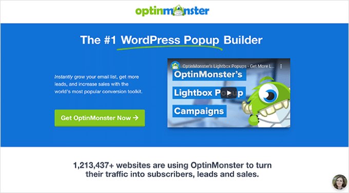
For more details, check out how to create a landing page with WordPress.
2. Make It Easy to Convert
On some landing pages, users give up because it’s unclear what they actually need to do, or because it requires too much effort. High-converting landing pages make converting simple.
Aim to offer a frictionless and efficient user journey by focusing on a clear message and making it easy to convert. Here are a few things you can do to optimize your landing page for usability.
Minimize the Number of Clicks Required
Make your landing page easier for users by minimizing the number of clicks required to convert. Every extra click can reduce your conversion rate by 10%.
I tell my customers to track how many clicks it takes for users to sign up or make a purchase and then find ways to reduce that number.
Depending on the purpose of your landing page, this could mean having a one-click checkout or anything else that streamlines the conversion process.
Minimize Unnecessary Form Fields
Next, I recommend thinking about the lead capture form on your landing page. The harder it is to complete, the less conversions you will ultimately have.
Now, the average number of form fields on a landing page is 5, and many experts recommend using just 3 or 4. But in my experience, reducing the number of fields is not always the best approach.
For example, even less motivated visitors who are not very interested in your product might be willing to fill out a very short form. This will result in more conversions, but you may get better quality leads by using a longer and more detailed form.
Also, fewer form fields will provide you with less information, robbing you of valuable insights about your users.
So aim to design a form that balances ease of conversion with the quality of information.
One effective middle ground is using multi-page forms. These break a longer form into smaller, manageable steps, which feels less overwhelming to users.
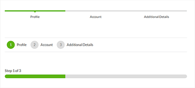
Multi-step forms can increase conversions because they reduce perceived effort by breaking long forms into smaller, more manageable steps.
Capture Partial Entries
No matter how straightforward your landing page is, you will always have users who start to fill in a form and then give up. Normally you’d simply lose the information they entered.
The average form abandonment rate is 68%, so you are missing out on a lot of information.
The best WordPress form plugins offer smart tools to combat form abandonment, such as WPForms’ Form Abandonment addon, which lets you capture partial entries.
This means the plugin will collect all the information a user types into a form, even if they don’t end up submitting it.
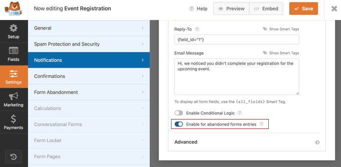
You can use the partial information you captured to follow up on these potential customers, such as by setting up automated emails to recapture their attention.
📝 Want to learn more about WPForms? This detailed WPForms review has all the information you need.
3. High Converting Landing Pages Use Compelling Copy
A landing page needs to get your visitors’ attention, tell a story that makes them want to keep reading, and finally, encourage them to take the action you want (convert).
Here are a few things you can do to make your landing page text more convincing.
Understand Your Audience
To write compelling copy, you first need to understand your target audience. This is the group of people who are interested in your products, services, or content.
They are likely to have certain interests, needs, demographics, or other characteristics that draw them to your products and services.

Discovering these factors using tools like Google Analytics will help you create better content that connects with these users, resulting in more conversions and sales.
Start With an Attention-Grabbing Headline
Only 20% of visitors will read the full text on your landing page, but 80% will read the full title. So, make sure your title grabs their attention immediately.
You can optimize your headline using online tools like WPBeginner’s free headline analyzer.
This tool will give your headline a score, and suggest ways you can improve it to get a higher score. Just repeat this a few times to create the perfect headline for your landing page.
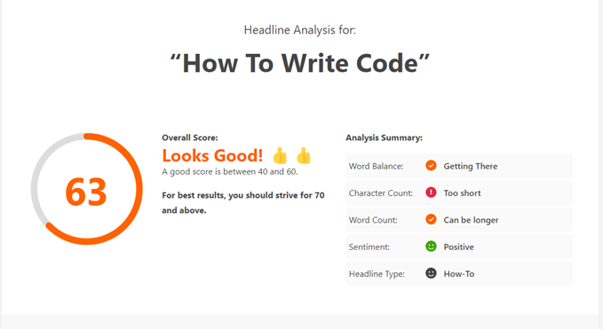
For the best results, your headline should be benefit-driven, not just descriptive.
Instead of saying “Our Project Management Software,” try something like “Finish Projects 2x Faster With Less Stress.” The best headlines communicate a clear value proposition in 10 words or fewer.
Include the Right Keywords
Chances are that most of your landing page visitors will come from Google, whether from organic search or your pay-per-click ads.
To maximize your traffic, you need to discover the keywords that will bring customers to your landing page and write great copy based on those keywords.
Make sure your primary keyword appears in your headline, subheadings, and naturally throughout the body copy. This helps both search engines and visitors immediately understand what your page is about. However, avoid keyword stuffing, as it can hurt both your rankings and your conversion rate.
Include Your Unique Selling Proposition
Some beginners make the mistake of just listing the features and benefits of their products and services on their landing pages. In my experience, this isn’t very convincing when you want someone to convert into a subscriber or customer.
If you want to get more conversions on your landing page, then you will need to focus on your unique selling proposition (USP). Essentially, this is the thing that makes your product or service different and better than anything that’s already available.
For example, here’s a small coffee business with a USP focused on the strength of their coffee and innovation.
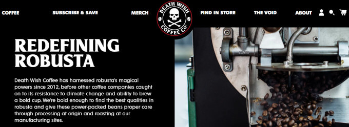
Make sure that your unique selling proposition is clear and reflected throughout your copy. This is the best way to convince someone to pick your product over the competition.
A strong formula for a USP is: [Result the customer wants] + [Specific time period] + [Addressing the objection]. For example: “Get 50% more leads in 30 days, without hiring a marketing team.”
Add Images and Video
Use eye-catching images to grab attention, break up your text, and illustrate your offering. Content combined with pictures has an 80% greater chance of being read.
Videos also improve conversions. According to WPBeginner’s content marketing research, 97% of marketers say that videos help customers understand their products better. Studies also show that adding a video to a landing page increases conversions by 86% on average.
When adding video, keep it short. Landing page videos between 30 and 60 seconds tend to perform best. You should also place your video above the fold when possible, and always include a thumbnail that encourages visitors to click play.
Increase the Perceived Value
Increasing the perceived value on a landing page is very important for convincing visitors to convert, whether it’s subscribing, buying a product, or taking another desired action.
It’s best to show the benefits using a number, such as the percentage saved. The WPBeginner team did this by showing a dollar value for a video course they offer for free.

Offering lead magnets such as eBooks is another way to incentivize users and increase perceived value.
Studies show that 55% of landing page submissions come from lead magnets.
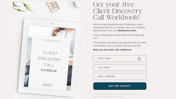
⭐ Need some inspiration? Here’s 19 lead magnets you can create today!
Write in Benefits, Not Just Features
One of the biggest copywriting mistakes on landing pages is focusing on features rather than benefits. Features describe what your product does, while benefits describe what your product does for the customer.
Instead of saying “Our software has 47 integrations,” say “Connect all your tools in one place and save 5 hours a week.”
Benefits tap into emotions and desires, which are what actually drive people to convert.
4. Foster Trust Among Your Audience
Building trust on your landing page is very important because it reduces how risky visitors perceive things to be. Visitors who don’t trust you won’t risk spending their money or sharing their personal information.
Social proof builds trust with new users by demonstrating that your previous customers found your product or service valuable. 9 out of 10 customers trust reviews and testimonials, and social proof can increase landing page conversions by 5%.
Your users have probably already left genuine testimonials and reviews on Facebook, Yelp, Google, TrustPilot, and other platforms. However, finding these reviews and including current testimonials on your landing page can be a lot of work.
That’s why I recommend using Smash Balloon Review Feeds Pro. It will automatically find testimonials and reviews from multiple platforms and display them on your page using stunning layouts.
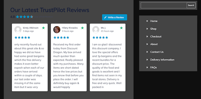
This will save you time and keep your landing page looking fresh. Best of all, these genuine testimonials will build trust with your audience and improve your landing page conversions.
For more information, check out this in-depth Smash Balloon review.
Other Trust Signals That Boost Conversions
Beyond testimonials, there’s several additional trust signals you should consider adding to your high converting landing page:
- Trust badges and security seals: Display SSL certificates, payment security badges (like Norton Secured or McAfee Secure), and money-back guarantee seals near your CTA and checkout areas.
- Client logos and case studies: If you serve businesses, showing recognizable client logos builds instant credibility. You can even link to detailed case studies for deeper proof.
- Real-time activity notifications: Showing recent signups or purchases creates urgency and validates that others are actively choosing your product. You can use a tool like PushEngage to add these notifications to WordPress with ease.
- Privacy assurances: A simple line like “We respect your privacy. Unsubscribe at any time” near your email capture form can significantly reduce hesitation.
5. Have a Compelling & Prominent CTA
Now that your landing page has an attention-grabbing headline and compelling content, and you are building trust using social proof, you will want to make sure your users click your CTA button or fill in your lead capture form.
Don’t leave this to chance! You can use directional cues to guide your visitor’s attention and nudge them towards taking the desired action.
These cues can be quite obvious, such as an arrow pointing at your CTA button or using a contrasting background color that’s hard to miss.
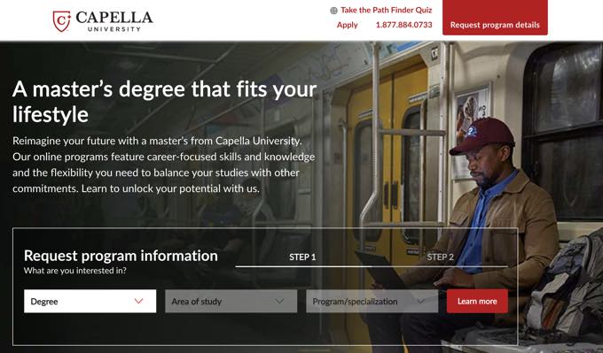
They can also be quite subtle. For example, you might use an image with people looking toward your call to action, or a mouse hover effect to highlight your CTA button.
Notice the visual cues on the landing page below. It features a photo of a man looking toward the form that needs to be filled in, and that form is placed in a box. Also, the ‘Step 1’ and ‘Step 2’ labels guide the user to what needs to be done next.
⭐ For more tips, see our guide on call to action best practices.
6. Turn Abandoning Users Into Customers
Even the most effective landing page will have visitors who decide to leave without taking action. Research shows that as many as 9 out of 10 visitors abandon landing pages.
A super effective landing page will grab the user’s attention before they leave and redirect their attention back to your offer. This is where opt-ins can come in handy.
OptinMonster is the best conversion optimization toolkit for WordPress. It has Exit-Intent technology that lets you track when users are about to leave your landing page so you can pop up a tailored message just in time.

In my experience, you can expect to see a 2-4% increase in conversions simply by using Exit-Intent. In some cases, this can be significantly more.
For instance, the lead SEO consultant at Fastrack used an OptinMonster Exit-Intent popup to recover 53% of abandoning visitors.
You can use the popup to offer incentives such as custom coupons, time-limited offers, a BOGO (Buy One Get One) offer, and other promotional tools to convert those visitors into customers.
7. Mobile Optimization Is Non-Negotiable
Mobile devices now account for approximately 55% to 60% of all internet traffic. If your landing page doesn’t look and function perfectly on a smartphone, you could be alienating the majority of your potential visitors.
Mobile users also have higher abandonment rates. Mobile cart abandonment sits at 80%, compared to 66% on desktop. To combat this, make sure your forms are easy to tap and complete on a small screen, your CTA buttons are large enough to tap with a thumb, and your page layout adapts cleanly to different screen sizes.
SeedProd and other modern WordPress page builders include mobile-responsive templates out of the box, so you can preview and fine-tune the mobile version of your landing page before publishing it.
8. Page Speed Directly Impacts Conversions
Research shows that 53% of mobile users abandon a page if it takes more than 3 seconds to load. Each additional second of load time can reduce conversions by approximately 7%.
To keep your landing page fast, compress all images, minimize the use of heavy scripts and third-party embeds, use a caching plugin, and consider a content delivery network (CDN) to serve content from servers closer to your visitors.
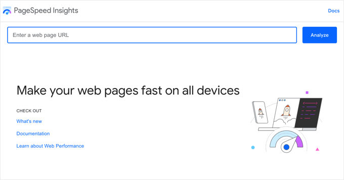
You can test your landing page speed using free tools like Google PageSpeed Insights or GTmetrix and aim for a load time under 2 seconds.
For more information, please see our guide on how to properly run a website speed test.
Frequently Asked Questions About High Converting Landing Pages
How many form fields should a landing page have?
There’s no universal answer, but research shows that fewer fields generally lead to higher conversion rates.
If you want to generate leads, then 3 to 5 fields is a common recommendation. For more complex sales processes where lead quality matters, a longer form with 5 to 7 fields may actually produce better results by filtering out low-intent visitors.
Should I use a long or short landing page?
It depends on your offer and audience. Short landing pages tend to work better for simple, low-cost offers where visitors need minimal convincing, like a free ebook or newsletter signup.
Long landing pages are more effective for higher-priced products or services where visitors need more information, trust signals, and persuasion before committing. When in doubt, try out both formats using A/B testing.
Do I need a separate landing page for each campaign?
Yes. Each ad campaign, email blast, or traffic source should ideally have its own dedicated landing page.
This allows you to match the landing page messaging exactly to the ad or link that brought the visitor there. By matching the messaging in this way, you can often dramatically improve conversion rates because visitors immediately see that they’re in the right place.
What is the difference between a landing page and a homepage?
A homepage serves as a general entry point to your website with multiple navigation options, links, and content areas.
Meanwhile, a landing page has a single focused goal and removes distractions to guide visitors toward one specific action. Homepages are designed for exploration, while landing pages are designed for conversion.
Expert Guides on Landing Pages
I hope these insights help you understand the anatomy of a great landing page and how you can grow conversions. You may also want to see these WPBeginner guides on landing pages:
- How to Create a Landing Page With WordPress
- What’s the Difference Between Landing Page vs Website?
- Advanced Landing Page Tips to Skyrocket WordPress Conversions
- Best Landing Page Templates for WordPress
- High-Converting Landing Page Examples That Actually Work
- Best WordPress Landing Page Plugins Compared
If you liked this article, then please subscribe to our YouTube Channel for WordPress video tutorials. You can also find us on Twitter and Facebook.


Moinuddin Waheed
Well done! Mr.John
Thank you for this expert insights regarding high converting landing pages.
This expert weekly column gives us so much to learn from the experts and developers of the plugin itself.
I would draw attention towards having relevant and compelling copywriting for converting users into customers. This aspect can’t be emphasized enough as it gives users reason to make decisions.
Dennis Muthomi
VERY excellent breakdown of high-converting landing page elements Mr John
One aspect I’d like to highlight is the importance of A/B testing.
The guide has covered crucial elements like compelling copy and prominent CTAs, but it’s essential to test different variations to find what resonates best with your specific audience.
For instance, I’ve seen cases where longer forms actually performed better than shorter ones, contrary to common advice.
Regarding the use of exit-intent popups, I’ve had great success with OptinMonster’s technology. But, I’d caution against overusing this feature, as it can sometimes negatively impact user experience.
A balanced approach, perhaps limiting exit-intent popups to once per session or using them only on specific pages, can help maintain a positive user experience while still capturing potential leads.
Moinuddin Waheed
Thank you Dennis Muthomi for sharing your invaluable experience and tips regarding the exit intent technology if optinmonster.
I can’t agree more to this fact that overuse can cause great disappointment to the users experience.
I have always tried to be cautious with this.
ans the suggestion to use only on specific pages is worth implementing to avoid bad user experience.
Jiří Vaněk
After installing Optin Monster, I became interested in landing pages because I could finally start measuring conversion rates and get some numbers to see whether they were successful or not. This was something new for me, so every piece of advice was really valuable. For example, something as small as where to correctly place a call to action. It may seem like a simple thing, but it’s not. I thank John Turner for his valuable advice, which I would have had a hard time finding elsewhere or would not have been free.
Mrteesurez
You have really crafted a great article full of useful tips. Distraction is the first elements that takes away users from a landing page, when more unnecessary elements dominate a landing page, readers are easily distracted.
In addition, one should me mindful of the use of colour of the elements and frequent use of the CTA.
Jiří Vaněk
You wrote it perfectly, Mr. Mrteesurez. Before I read this article, I was making the exact same mistakes. In the pursuit of making the page look as fantastic as possible, I used many elements offered by Elementor without realizing that I was actually just distracting visitors and thus achieving lower conversion rates. Only after reading several articles, including this one from Mr. Turner, did I realize how much I was mistaken in my pursuit of a beautifully designed page and how much it was hurting me. Sometimes less is more.
Dayo Olobayo
Thanks for this brilliant article. Personally, I’m always turned off whenever a website has to many ads that are both obstructive and distractive. I will ensure to put the tips into use on my websites.