Do you want to hide a specific WordPress widget for mobile users?
Widgets are dynamic content that is often displayed in the website sidebar or footer. Sometimes, a widget may look good on a desktop computer or laptop but not on smaller mobile devices.
In this article, we will show you how to hide a WordPress widget on mobile devices without writing any code.
Why Hide a Widget on Mobile in WordPress?
Your website may look great on full-sized computer screens, but that doesn’t necessarily mean it will look good on smaller screens, too.
Even if the layout doesn’t immediately look cluttered when viewing the mobile version of your WordPress site, it’s important to always scroll to the very bottom.
In most responsive WordPress themes, widgets will appear in different places depending on the size of the visitor’s screen. Often, WordPress themes move widgets to the very bottom of the page.
Let’s look at an example.
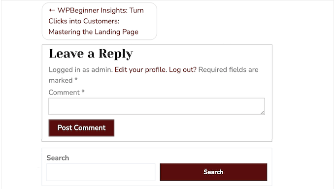
The following image shows how a site looks on a desktop computer. As you can see, the search widget appears at the top of the sidebar.

However, the sidebar widget appears below the content when viewed on a smartphone.
This means visitors will need to scroll to the very bottom of the page in order to search your blog posts, products, or other content.
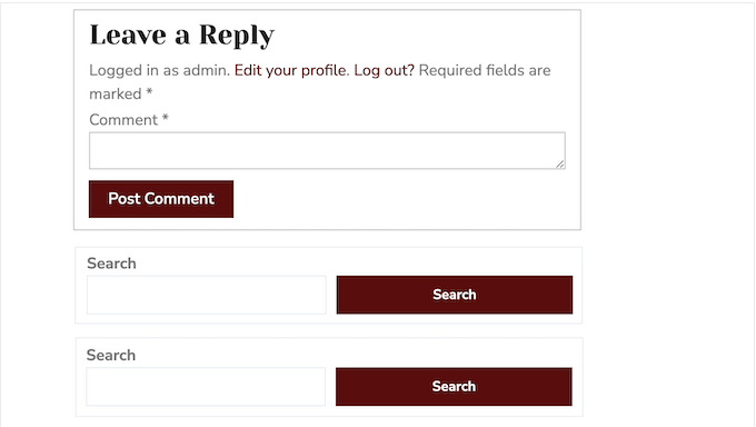
Even worse, sometimes this behavior results in two identical widgets appearing next to each other.
For example, many WordPress blog owners place a contact info widget in both the sidebar and the footer. If these widgets move, then mobile visitors may see the same widgets next to each other.
With that being said, let’s see how you can easily hide a widget on mobile in WordPress.
How to Hide a Widget on Mobile in WordPress
The easiest way to hide widgets for mobile users is by using the Widget Options plugin. This plugin lets you show different widgets depending on the date, user role, device, and more.
First, you need to install and activate the Widget Options plugin. For more details, see our step-by-step guide on how to install a WordPress plugin.
Upon activation, you need to go to the Appearance » Widgets page in your WordPress dashboard.
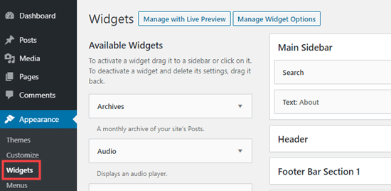
On this screen, you will see all the widgets you have added to your WordPress website.
To edit a widget, simply click on its name.
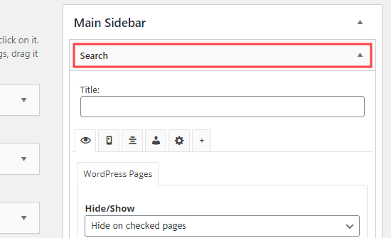
In the widget settings, you will see some new sections added by the Widget Options plugin.
To start, click on the small mobile icon and make sure the ‘Hide/Show’ dropdown shows ‘Hide on checked devices.’
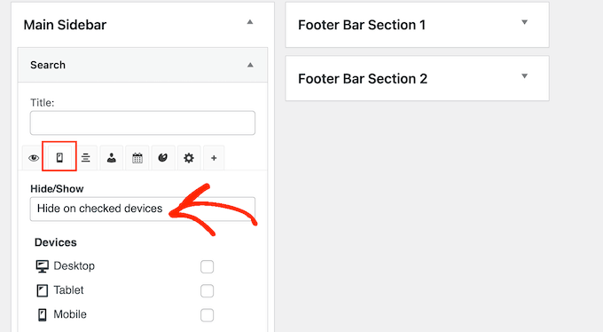
After that, simply check each device where you want to hide the widget.
You will typically want to check the box next to ‘Tablet’ and ‘Mobile.’
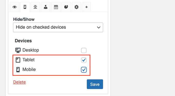
After that, click on the ‘Save’ button to store your changes.
Now, go ahead and visit your WordPress website using a mobile device. The widget will no longer appear in the widget area.
How to Make a Mobile Version of a Widget in WordPress
Sometimes, you might want to show one version of a widget to mobile visitors and a different one to desktop users.
For example, you might want to show your five most recent posts on desktop but only three posts on mobile devices so the screen doesn’t look cluttered.
To do that, you simply need to add two separate Recent Posts widgets to your site. For more information, please see our step-by-step guide on how to add widgets in WordPress.
You can then configure one widget to appear on desktop computers and the other to appear on mobile devices.
First, open the widget that you want to show to desktop users. Then, click the small mobile icon, and make sure the ‘Hide/Show’ dropdown is set to ‘Hide on checked devices.’
After that, go ahead and check the boxes next to ‘Tablet’ and ‘Mobile.’
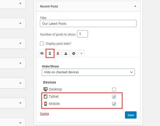
Now, this widget will only appear to visitors using a desktop computer.
Next, you can make any changes to the widget. For example, we are typing ‘5’ into the box next to ‘Number of posts to show.’
When you are finished, don’t forget to press the ‘Save’ button to store your settings.
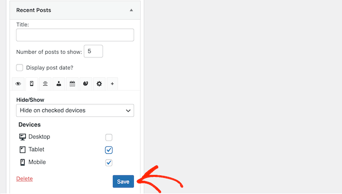
After that, you are ready to make the second widget mobile-only.
Simply repeat the same process described above, but this time, check the box next to ‘Desktop’ to hide the widget on desktop devices.
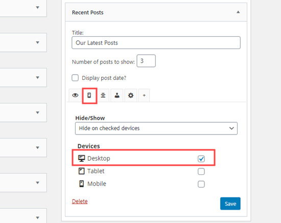
You can now make any changes to your mobile widget. For example, you might type ‘3’ into the ‘Number of posts to show’ box.
As always, click on ‘Save’ when you are finished. You now have a desktop version and a mobile version of the same widget.
We hope this article helped you learn how to hide a widget on mobile devices in WordPress. You might also like to check out our list of the most useful widgets for your site, or see our guide on how to show or hide widgets on specific pages.
If you liked this article, then please subscribe to our YouTube Channel for WordPress video tutorials. You can also find us on Twitter and Facebook.


Jiří Vaněk
This is an excellent and straightforward solution for all of my websites where I don’t use Elementor. In Elementor, I’ve become accustomed to having options that let me hide elements on desktop, tablet, or mobile with ease. However, in the standard Gutenberg editor, I felt quite lost when it came to this functionality. I had considered using a custom CSS class and manually adding the code into the template, but this method is so much simpler and almost effortless. Thanks for the tutorial—it’s a real time-saver!
kzain
This post is a lifesaver! I was struggling with duplicate footers on mobile which made my website look messy. Thanks to this article, I figured out how to hide one of them easily. Now it looks much cleaner and professional on phones – what a difference!
Hajime
Thank you for the easy to understand guide. However, in my AvadaTheme, the device selection tab and checkboxes do not seem to appear.
My AvadaTheme is V7.6.1. Is there a difference in specifications between versions?
WPBeginner Support
There may be a conflict between the plugin and your theme, we would recommend checking with the plugin’s support and they should be able to assist!
Admin
Aymen Boukhatem
thank you so much for your help <3
WPBeginner Support
You’re welcome
Admin
Soorya
Thanks for the guide. It was so helpful
WPBeginner Support
Glad our guide was helpful!
Admin
FRB Dogs "Rich"
This was a great article to quickly allow me to hide extraneous footers that look like duplicates when on a mobile display as the side & footers were on the bottom. I hide one of them on a mobile device and voila! Looks so much more professional. Thank you!
WPBeginner Support
You’re welcome, glad our guide was helpful
Admin
Jean-Claude
Thank you. Very helpful!
JC
WPBeginner Support
You’re welcome
Admin
Mamooty Reev
Does the plugin use php, js, or css to conditionally hide the widgets?
WPBeginner Support
For a question like that, you would want to reach out to the plugin’s support and they would be able to let you know the current method being used.
Admin