When we started customizing WordPress themes, moving the sidebar from right to left seemed like it should be simple.
Yet we discovered many users struggle with this basic layout change because each theme handles it differently, and some don’t make the option obvious.
After helping users through WPBeginner, we’ve learned that sidebar positioning can significantly impact how visitors interact with your content.
Whether you’re following design best practices or adapting to your audience’s reading habits, knowing how to change your sidebar’s position is a valuable skill.
In this guide, we’ll show you the easiest ways to change your sidebar position in WordPress.
💡Quick Answer: How to Change the Sidebar Side in Your WordPress Theme
Here is a quick breakdown of the methods we’ll cover so you can jump to the one that fits your needs:
- Method 1: Use the WordPress Customizer – This is the easiest option and is best for users with a classic theme that already has a built-in setting to change the sidebar layout.
- Method 2: Use Custom CSS Code – This method is for users with a classic theme that does not have a built-in sidebar option. It requires adding a small code snippet.
- Method 3: Use the Full-Site Editor (FSE) – This is the standard method for anyone using a modern block theme. You’ll simply drag and drop the sidebar to a new position.
- Method 4: Use the CSS Hero Plugin – This is the best choice for beginners on any theme who want a visual, code-free way to change the sidebar position and make other design customizations.
How Do I Change the Sidebar Side in My WordPress Theme?
To change the sidebar side in your WordPress theme, you first need to identify if you’re using a classic theme or a block theme. The method you use will depend entirely on your theme type.
Classic themes typically use the Theme Customizer or custom CSS for this change. Block themes use the newer Full-Site Editor.
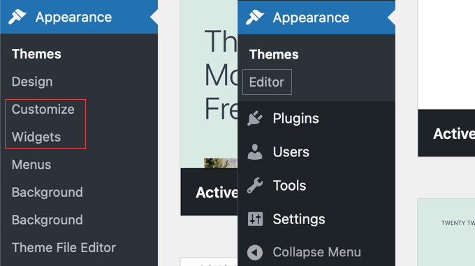
Here’s how to quickly check which one you have. In your dashboard, go to Appearance. If you see an ‘Editor’ menu, you are using a block theme. If you see ‘Customize’ and ‘Widgets’ instead, you have a classic theme.
Moving the sidebar can be useful for many reasons. For instance, websites with right to left languages feel more natural with the sidebar on the left side.
You might also want to improve the user experience on your site. If you notice visitors on your eCommerce site scan pages in a specific pattern, adjusting the sidebar can make shopping feel more intuitive.
With all this in mind, let’s look at how to change the sidebar side on your WordPress blog or website.
We have 4 easy methods, and you can use the quick links below to skip to the one you prefer:
- Method 1: How to Change the Sidebar Side With WordPress Customizer (Classic Themes)
- Method 2: How to Change the Sidebar Side With Code (Classic Themes)
- Method 3: How to Change the Sidebar Side With FSE (Block Themes)
- Method 4: How to Change the Sidebar Side With CSS Hero (All Themes)
- Alternative: Create Custom Sidebars With a WordPress Page Builder Plugin
- Frequently Asked Questions About WordPress Sidebars
Method 1: How to Change the Sidebar Side With WordPress Customizer (Classic Themes)
This method is for people using a classic theme. This means you can still use the WordPress customizer to style your site design, and the Widgets section in the WordPress admin’s Appearance menu still exists.
If the theme customizer is missing from your WordPress dashboard, you are likely using a block theme and must skip to the third method.
At times, classic theme developers offer multiple sidebar placements that you can choose from. You can confirm if this is true by using the WordPress customizer and picking the sidebar position you prefer there.
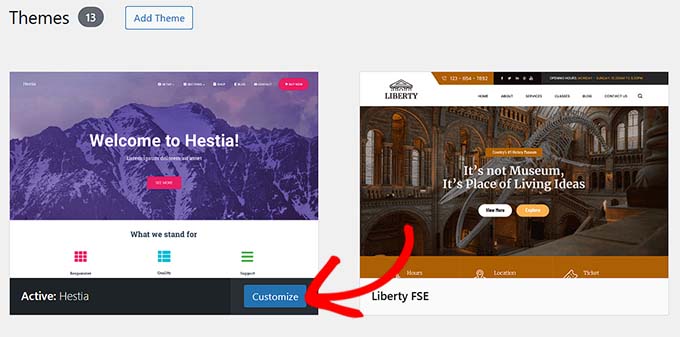
First, go to Appearance » Customize. We are using the Hestia theme as an example.
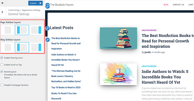
Here, head over to the Appearance Settings » General Settings page from the left column
As you can see, Hestia has three sidebar templates: one without a sidebar, one with a left sidebar, and one with a right sidebar. This allows us to change the sidebar side in one click. Here, we’ve changed the sidebar side to the left.
This setting controls the default sidebar layout for your entire website. However, Hestia also allows you to customize the blog sidebar position separately, so it only affects your blog posts or the posts page.
Once you have made the changes, you can add the available widgets to the sidebar like normal. For more information, check out our guide on how to add and use widgets in WordPress.
Then, just click ‘Publish.’
While this is a convenient feature, it all depends on the theme. We strongly recommend checking your theme documentation to see if you can change the sidebar using the customizer.
If not, then jump down to the next method.
Method 2: How to Change the Sidebar Side With Code (Classic Themes)
If your classic theme doesn’t offer multiple sidebars to choose from, then you can change the sidebar side manually using CSS code.
Most classic themes use a CSS property called float to position the sidebar and content area next to each other. Our goal is to find the CSS for both elements and simply reverse their float direction.
We recommend using a staging site and/or a child theme to play around with this method. This way, if an error happens, it won’t affect your parent theme and/or your live website.
Plus, using a child theme can prevent your changes from getting overwritten when there is a theme update.
Step 1: Use the Inspect Tool to Locate Your Sidebar CSS Class
The first thing you will do is open your website. Then, hover around your sidebar area and use your browser’s Inspect tool.
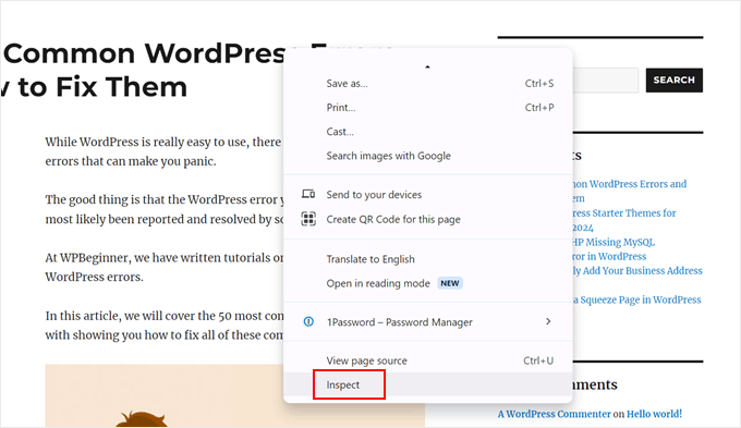
If you use Chrome, then you can just right-click on the area and select ‘Inspect.’
For more information, you can check out our basics of Inspect element guide.
Now, what you want to do is hover your cursor over the HTML and CSS lines on the top right side of the page.
When you see that your entire sidebar area is highlighted, click on that line. For us, it was <aside id=”secondary” class=”sidebar widget-area”>.
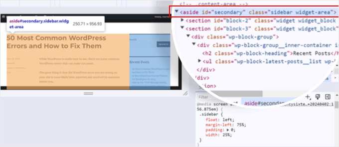
The’ Styles’ tab at the bottom of the page has all the CSS properties related to the sidebar.
In our case, we saw that the CSS class for the sidebar area is .sidebar. There are also rules that determine the position of the sidebar, which, in this case, is the left side.
Important: The class names like .sidebar and .content-area used in this tutorial are specific to our example theme. You must use the exact class names that you discovered for your own theme in the previous step.
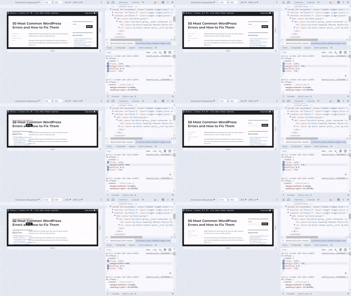
We know this because when we uncheck the margin-left rule, the sidebar moves to the other side.
Here is the code for the sidebar area of our theme:
.sidebar {
float: left;
margin-left: 75%;
padding: 0;
width: 25%;
}
You can copy and paste this code to a text editor because we will need it for a later step. Or, you can just keep this tab open for later.
Now that we know the CSS class for the sidebar area, we also have to find the class for the main content area that displays all your posts or post content.
What you can do is hover over the HTML and CSS lines to see which line highlights the main content area. Here, we found out that it was the line <div id=”primary” class=”content-area”>.
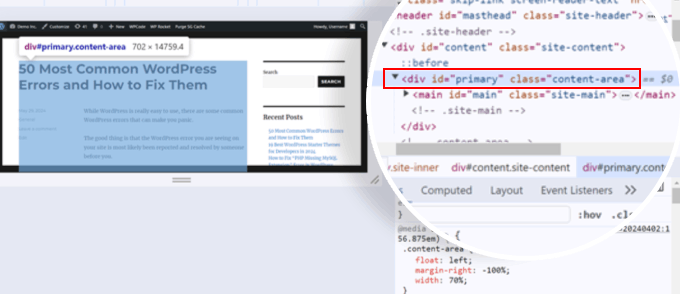
Like before, you can scroll down to the ‘Styles’ tab to see what the CSS class for that area is. In this case, it was .content-area. Here is the code for it:
.content-area {
float: left;
margin-right: -100%;
width: 70%;
}
Again, you can copy and paste your content area’s CSS code to a text editor or keep this tab open for the next step.
Now that we know the CSS classes of your sidebar and content area, we can edit your style.css theme file to change the sidebar’s side.
Step 2: Customize Your Theme’s style.css File
Usually, you will need to edit your style.css directly using your web hosting provider’s file manager or FTP client. However, the style.css file can be pretty long, and if you make a mistake, it could affect your entire website design and ruin your user experience.
That’s why we recommend using WPCode. We have found it to be the safest and easiest way to add custom CSS without editing your theme files directly.
If your code changes cause unintentional errors, you can deactivate it with a single click, and your website will return to normal.
To learn more, see our WPCode review.
Note: For this tutorial, you can use the free WPCode version, but upgrading to a premium plan will give you access to more advanced features. For more information, check out our full WPCode review.
First, go ahead and install WPCode to your WordPress. If you need step-by-step instructions, read our guide on how to install a WordPress plugin.
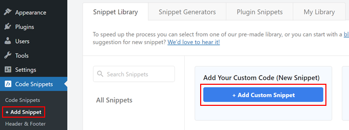
Once done, go to Code Snippets » + Add Snippet. Then, select ‘Add Your Custom Code (New Snippet)’ and click the ‘+ Add Custom Snippet’ button.
Now, type a title for your custom code. It can be something like ‘Change Sidebar Side.’
Then, change the Code Type to ‘CSS Snippet.’
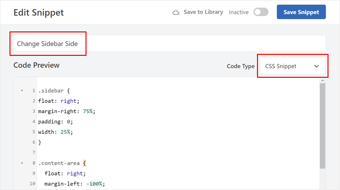
Once done, you need to insert the CSS code snippets of your sidebar and content areas into the Code Preview box.
You can separate them with an empty space to make it easy to identify them, like so:
.sidebar {
float: left;
margin-left: 75%;
padding: 0;
width: 25%;
}

.content-area {
float: left;
margin-right: -100%;
width: 70%;
}
Now, let’s customize this CSS code. What you want to do is change the CSS properties that define the sidebar and main content areas’ placements.
In our case, these CSS classes have float, margin, padding, and width properties, but this may look different depending on your theme.
For our sidebar area, we changedleft to right in the float and margin properties. This means the sidebar area will be in the opposite direction of where it was originally placed.
.sidebar {
float: right;
margin-right: 75%;
padding: 0;
width: 25%;
}
With that part done, let’s change the placement of the content area. What worked for us is we changed float: left to float: right and margin-right to margin-left. This tells WordPress to move the content area to the right.
Additionally, we added position: relative and right: 100% properties. These ensure our content area won’t go too far off the right side.
.content-area {
float: right;
margin-left: -100%;
width: 70%;
position: relative;
right: 100%;
}
Again, what works for our theme may not work with yours because every theme has different names for its CSS classes and uses different properties. We recommend reading this complete CSS reference to figure out what works best for your theme.
Additionally, feel free to play around with the percentages of the width and margins in the code to adjust the sidebar placement.
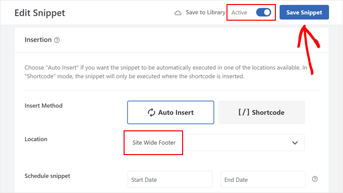
Once you have changed your code snippet, scroll down to the Insertion section. Make sure the Insert Method is ‘Auto Insert.’
As for the Location, select ‘Site Wide Footer’ so that your code can override the existing code in your style.css file.
Now, you can click on the toggle at the top right corner to make the code ‘Active’ and click ‘Save Snippet.’ Then, preview your website to see the results.
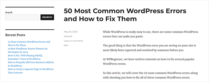
If you look at the screenshots above, you can see that the sidebar on our demo website was on the right side.
After editing the code in style.css, the theme now has a left sidebar:
Now that you have changed the sidebar side, you can start changing or adding more sidebar content. Here are some ideas to help you out:
- How to Add an Image in WordPress Sidebar Widget
- How to Add a Link to Widget Titles in WordPress
- How to Add Custom Styles to WordPress Widgets
- How to Disable Unwanted Widgets in WordPress
- How to Customize the Display of WordPress Archives in Your Sidebar
💡Pro Tip: Some modern themes use a CSS system called Flexbox instead of floats.
If you use the Inspect tool and find a property like display: flex; in the container holding your content and sidebar, you may be able to simply add flex-direction: row-reverse; to it to swap the sidebar side.
Method 3: How to Change the Sidebar Side With FSE (Block Themes)
If you use a block theme, then you won’t see a Widgets section in your WordPress admin. You may be wondering how to change the sidebar side if that menu doesn’t exist.
Thankfully, the process is much simpler compared to the one for classic themes. This is because block themes use Gutenberg blocks, and you can simply drag and drop the elements to change their position using the full-site editor (FSE).
Secondly, block themes will usually have a template that includes a sidebar. We simply need to change that, and every page that uses the template will be affected. You can check your theme’s documentation to see what the template is called to access it.
For the demonstration, we will use the Twenty Twenty-Four theme, which happens to have a page with a sidebar template.
First, go to Appearance » Editor in your dashboard.
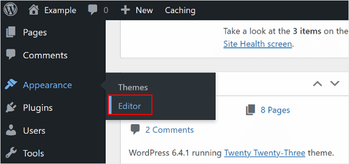
Here, you will see some menus to customize your block theme.
Select ‘Templates.’
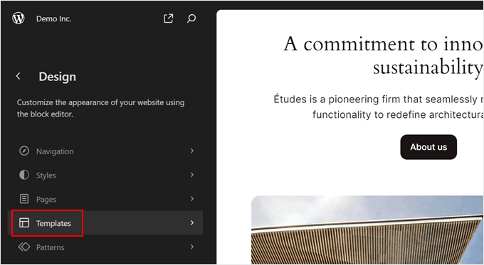
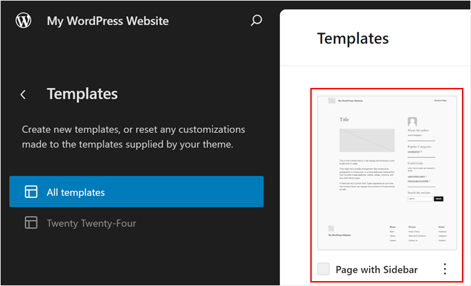
Now, find the template with the sidebar that you’d like to edit.
In Twenty Twenty-Four, that is the ‘Page with Sidebar’ and ‘Single with Sidebar.’ Depending on your theme, the template’s name may not clearly mention that it has a sidebar, so again, you should check your theme’s documentation.
Go ahead and select that sidebar template.
Typically, block themes will include the sidebar and the main content area in a columns block. This keeps everything neat, organized, and nicely separated from one another.
To change the sidebar side, you only need to select the column that makes up the sidebar and move that around.
The easiest way to do this is to click on the ‘List View’ feature on the left side of the page.
Then, click on the ‘Columns’ block to expand it and hover over its content until you find the column that contains the sidebar elements.
In our case, it helped that the Twenty Twenty-Four theme has a template part called ‘Sidebar,’ so identifying it was easy. That said, some themes may just include a regular, unnamed group of blocks that make up the sidebar.
You will know that you have selected the right column when a rectangular highlight and a toolbar appear around the entire group of blocks for the sidebar.

Now, in the sidebar column’s toolbar, you will see arrows you can use to change the column’s placement.
Click on it, and depending on how the Columns block is designed, you may need to play around with the position until you find the right fit.
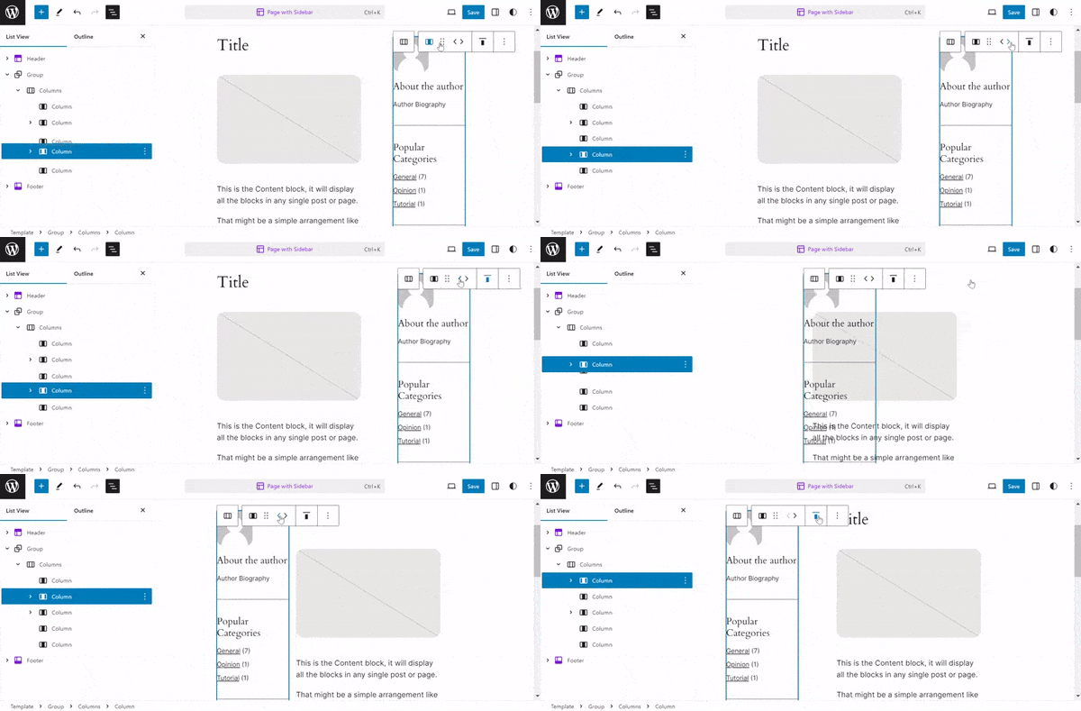
The theme developer might have added some empty columns to create space between the main content area and the sidebar area.
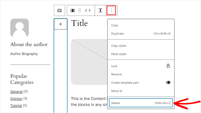
If you want to delete it, just find the right empty column using the List View feature like before. Then, on the block toolbar, click the three-dot menu and select ‘Delete.’
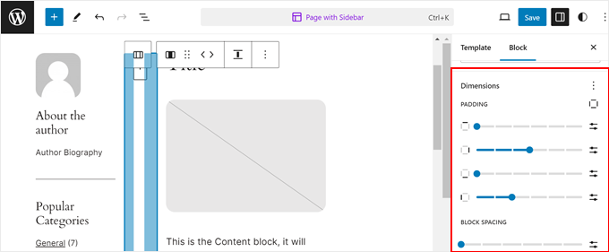
Or if you want to make more space between the sidebar area and the content area, then you can open the Block settings tab and switch to the ‘Styles’ section.
Then, in the ‘Dimensions’ section, you can drag the slider for the padding, margin, or block spacing.
Once done, click ‘Save.’
Then, you can preview all the pages on mobile and desktop that are using the template you just edited to see what it looks like.
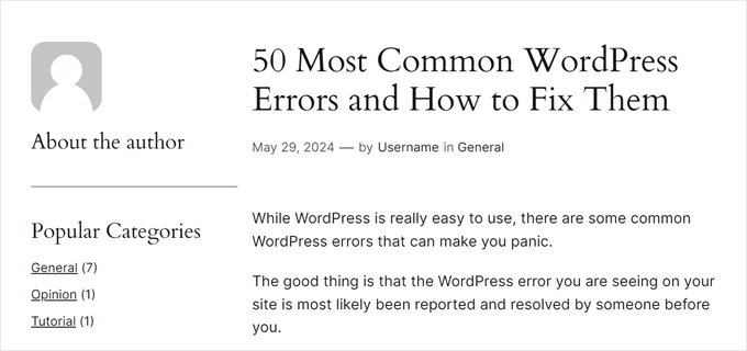
What if you’ve edited the template, but your pages or posts are not using it?
All you need to do is open the page or post in the block editor. Then, in the Post settings panel, click the link in the ‘Template’ field and select ‘Swap template.’
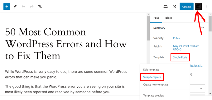
Now, just choose the template that’s using the sidebar.
After that, you can update the page or post.
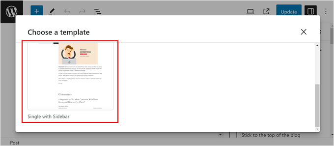
For more tips and tricks using the full-site or block editor, check out these guides:
Method 4: How to Change the Sidebar Side With CSS Hero (All Themes)
The next method uses a paid plugin called CSS Hero, which is the best WordPress plugin for visual CSS editing. This plugin makes it easy to customize your theme’s CSS without touching any code, making it great for beginners.
This method also works with all themes, so if you find that the previous methods slightly limiting, then you can use this one instead. That said, there is no free plugin version, so you have to purchase a paid plan.
For more information about the plugin and its pricing, check out our CSS Hero review.
First, download the plugin to your computer and install it on your WordPress website. For step-by-step instructions, check out our beginner’s guide on how to install a WordPress plugin.
Once installed, you will see a ‘CSS Hero’ menu in the toolbar. Click on it to open the visual CSS editor.
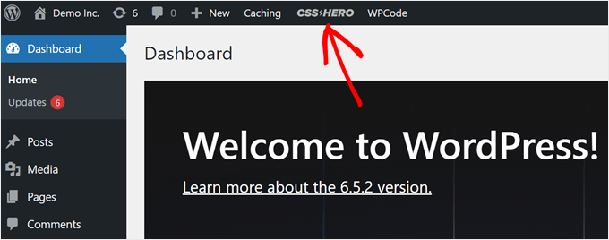
Keep in mind that since not all WordPress themes work the same way, the way you use CSS Hero to change the sidebar side will be different. So, we encourage you to play around with the platform to see what works for you.
That being said, we will show you what settings we customized to change the sidebar side from the right to the left side.
First, click on the sidebar area on your page. You will know that you’ve clicked the right one when all of the elements in your sidebar are selected as a group and have a rectangular highlight around them.
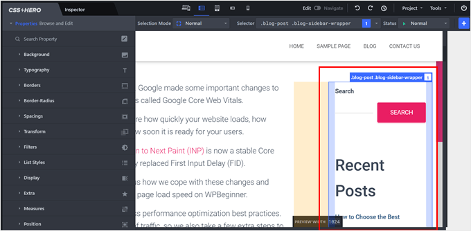
On the left side of the page, you will see some menus to customize your elements.
In our experience, the settings that can change the sidebar placement are Position, Measures, and Spacings.
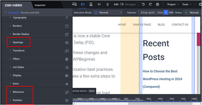
Position determines how the sidebar is placed in relation to the other elements on the page. Here, you can select ‘Absolute,’ which will give you some freedom on where the sidebar should be.
From here, you can change the Top, Right, Bottom, and Left pixels to place the sidebar.
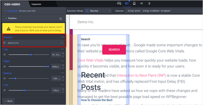
You can see that now the sidebar and the main content area are on the same side.
To fix this, you can hover over the container that makes up the main content area and click on it.
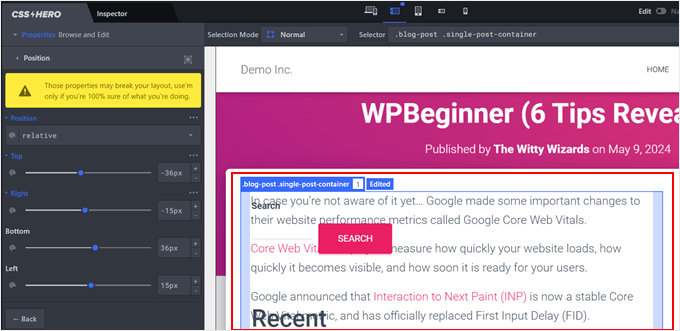
Now, in the left side panel, just adjust the Position settings until you find the right fit.
What we did was we left the position as ‘Relative’ and adjusted the Right pixels.
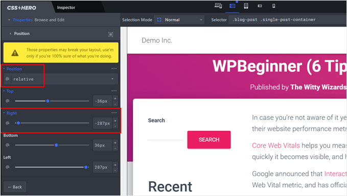
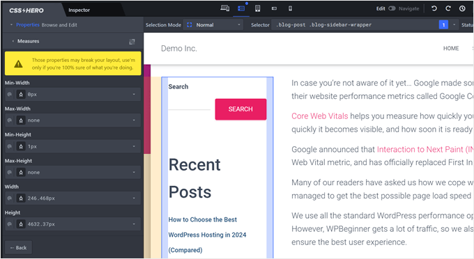
Technically, this is all you need to do. But if you want to adjust the size of the sidebar, then select the sidebar area and go to the ‘Measures’ settings.
Here, you can change the sidebar’s width and height.
If you want to change the spacing between the sidebar area and the main content area, then you can go to ‘Spacings.’
You will see some sliders to adjust the element’s padding and margin here.
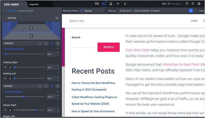
Again, we encourage you to explore this plugin’s settings to change the sidebar side to your exact liking.
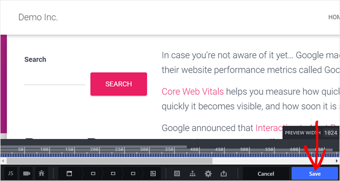
Once you are done, you can click the ‘Save’ button on the bottom right corner of the page.
Alternative: Create Custom Sidebars With a WordPress Page Builder Plugin
So far, we’ve explored methods to change the sidebar location for your entire website. But what if you only want specific sidebars for certain pages or post types? After all, not every page needs the same sidebar content.
For example, your homepage might benefit from a more general sidebar with social media icons and a call to action. However, a product page might be better with a sidebar showcasing related products or customer reviews.
In this case, you may want to create custom sidebars for your WordPress theme. With custom sidebars, you can:
- Assign specific sidebars to different pages or post types. This allows you to tailor your sidebar content to each page’s specific needs.
- Create a more dynamic and engaging user experience. By offering relevant content in the sidebar, you can keep visitors engaged and interested in exploring your website further.
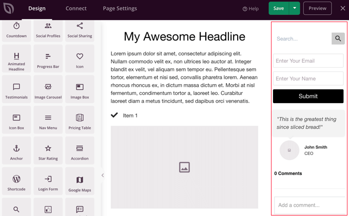
Here’s where a WordPress page builder plugin comes in handy. These plugins offer drag-and-drop functionality and extensive template libraries, making it easy to create custom sidebars.
We recommend using SeedProd, which is a popular and beginner-friendly page and theme builder plugin. With SeedProd, you can easily design custom pages and themes with their user-friendly interface.
You can check out these articles for more information:
- How to Add Custom Header, Footer, or Sidebar for Each Category
- How to Display Different Sidebar for Each Post and Page in WordPress
Alternatively, you can use the Thrive Architect page builder. This tool also has tons of theme kits and landing page templates, and even offers a feature to create a sticky floating sidebar widget. This is useful for keeping your sidebar sticky as users scroll down the page.
Frequently Asked Questions About WordPress Sidebars
Here are some questions that our readers frequently ask about the sidebars on their websites:
How do I change the sidebar position in WordPress?
The method you use depends on your theme. For classic themes, you can change the position in the Theme Customizer if the option exists, or by adding custom CSS. For modern block themes, you can simply drag and drop the sidebar column to the other side in the Full-Site Editor.
How to customize sidebar in WordPress?
You can customize the sidebar’s content using either widgets or blocks. If you have a classic theme, navigate to Appearance » Widgets to add or remove items.
If you use a block theme, go to Appearance » Editor and edit the sidebar template part directly by adding or removing any WordPress block.
How do I add a left and right sidebar in WordPress?
Adding both a left and right sidebar requires a theme that supports a three-column layout.
If your theme doesn’t have this option built in, the easiest way to create a custom three-column layout is with a WordPress page builder plugin like SeedProd or Thrive Architect.
How to change sidebar width in WordPress?
The most reliable way to change the sidebar width is with custom CSS. You can use your browser’s Inspect tool to find your sidebar’s CSS selector and then add a new width rule, like .sidebar { width: 30%; }.
Alternatively, a plugin like CSS Hero allows you to adjust the width visually without code.
We hope this WordPress tutorial helped you learn how to change the sidebar side in WordPress. You may also want to check out our article on how to add a full-screen responsive menu in WordPress and our list of the best WordPress sidebar tricks to get maximum results.
If you liked this article, then please subscribe to our YouTube Channel for WordPress video tutorials. You can also find us on Twitter and Facebook.


Fred
Thanks for the tip to change sidebar in classic. It helped me a lot!!
WPBeginner Support
You’re welcome
Admin
Steven Denger
This would be nice if it worked. It moved it over but throws my sidebar all the way to the bottom of page.
WPBeginner Support
It sounds like your specific theme may have some conflicting CSS or similar. If you check with the theme’s support they should be able to assist.
Admin
Dragoon
I have found 116 different .sidebar on my theme which one should I edit?
mama
how to move comment field from right to left in wordpress
first comment thean posted date then category’
Yogi
That is a nice article, float from right to left is doing the trick here. I would also suggest to make a new template for this where one shows the sidebar on the left and other shows the sidebar on the right. This will give users the option to select the desired design for the page.
Ronny
As good as this tutorial is, i noticed that it is fraught with many errors. For instance, there are no changes between the @media rule and the modified one. Please check all the codes in the article again.
Thanks, anyway…