Menus are essential for helping visitors navigate your WordPress website and find more of your posts and pages. Fullscreen responsive menus can be particularly helpful when designing your website for mobile users.
When your users click or tap a hamburger icon, a fullscreen overlay of your website’s menu will be displayed using a beautiful animation.
We have experimented with a few different menu types on our own websites to see what gets the best results. And in this article, we will show you how to add a fullscreen responsive menu in WordPress without writing any code.
💡 Quick Answer: How to Add a Fullscreen Responsive Menu in WordPress
You can easily add a fullscreen responsive menu to your WordPress site using the FullScreen Menu plugin. Just install and activate it. Then customize its settings for design, animation, and content.
Why Add a Fullscreen Responsive Menu in WordPress?
A fullscreen responsive menu makes it much easier for visitors to navigate your WordPress website or WooCommerce store on smartphones and tablets.
By using the entire screen for the menu, it’s simple to tap links without accidentally selecting the wrong item.
With more people browsing on mobile than desktop these days, checking how your site looks on small screens is essential.
A responsive menu automatically adjusts to different screen sizes, ensuring a smooth experience for every visitor.
Let’s take a look at how to add a fullscreen responsive menu in WordPress.
Step 1: Install and Activate the FullScreen Menu Plugin
The first thing you need to do is install and activate the FullScreen Menu plugin.
You can check out our step-by-step guide on how to install a WordPress plugin for beginners for more details.
Step 2: Configure General Menu Settings
Upon activation, you should head over to the Fullscreen Menu Options page in your WordPress admin menu to configure the plugin settings.
It will take you to the ‘Settings’ tab automatically. Get started by checking the ‘Activate Animated Fullscreen Menu’ checkbox to enable the menu.
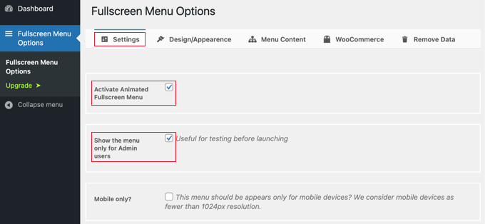
It’s a good idea to also check the ‘Show only for admin users’ box at first. This will let you see the changes as you configure the menu, but visitors to your site will not be able to see it until you are finished.
Don’t forget to come back and uncheck that box when you are done.
Below these options, you’ll find other settings that let you show the menu only on mobile devices, close the menu on a click or scroll, and hide the menu on specific pages.
For our example, we will leave these settings unchecked, but feel free to customize them as you wish for your own site.
Step 3: Customize Menu Design and Appearance
Next, we will customize the menu’s design. Fortunately, the menu plugin allows you to do this without needing custom CSS.
To customize the menu, you’ll need to click on the ‘Design/Appearance’ tab at the top of the page. On this page, you can choose the colors, font, and animation settings for your menu.
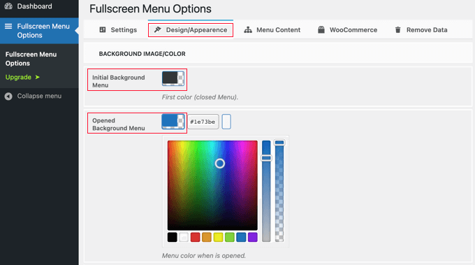
At the top of the page, you will notice two color settings. The first color is for the hamburger menu icon. This typically appears in the header area of your website. When your visitors click or tap it, the fullscreen menu will be shown or hidden.
The second color setting is for the menu’s background.
When you click on each box, a color palette will appear. You can either click on the color you wish to use or type its hex code.
After choosing the menu colors, you should scroll down the page to the Font/Appearance section. Here, you can choose the font color, family, and size that will be used for the menu text.
For this tutorial, we recommend sticking with the default font settings, which often use the font from your theme.
This is a good choice because it will match your website’s overall design, and loading additional fonts can sometimes slow down your WordPress site’s performance and speed.
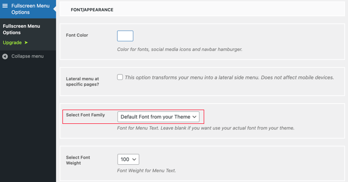
There are also settings to display a lateral side menu on specific pages and scroll the main menu if it’s not tall enough. For this tutorial, we will leave those settings unchecked, but feel free to experiment with them on your own WordPress blog or website.
After that, scroll down to the ‘Animation Settings’ section. Here, you can adjust two main settings.
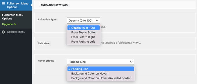
The first of these is ‘Animation Type’. This lets you select the animation direction when the menu is activated. You can choose from top to bottom, left to right, and right to left.
The second setting is the effect you get when hovering the mouse over a menu entry. The choices are a subtle line that appears (like a padding line), a change in background color, or a background color change with a rounded border.
Step 4: Define Fullscreen Menu Content
Finally, you’ll need to scroll back to the top of the page and click the ‘Menu Content’ tab. Here, you can select the WordPress menu that will be displayed on your fullscreen menu.
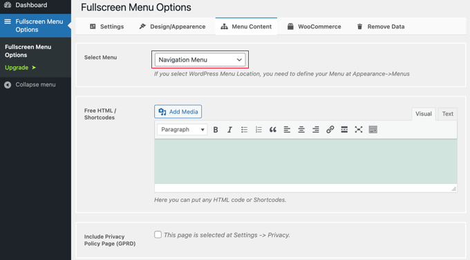
Next to ‘Select Menu’ at the top, you’ll need to choose a menu from the dropdown list. If you have not created a navigation menu yet, then check out our guide on how to add navigation menus in WordPress.
If you would like additional content displayed on the menu screen, then you can add it in the next section, labeled ‘Free HTML / Shortcodes’. Simply type your content into the editor box and add any media files you would like. This content will be displayed underneath the menu.
There’s also a checkbox that will include a link to your privacy policy page. Many website owners prefer to add this in the footer instead of the main menu, though.
Next, you might like to add social icons as menu items. These will be displayed in a row at the bottom of your fullscreen menu.
To add them, simply scroll down to the ‘Social Icons’ section and enter a title for the icon, such as ‘Facebook’. After that, choose the appropriate icon and type the URL to your social page.
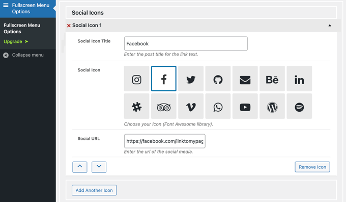
You can add more icons by clicking the ‘Add Another Icon’ button.
Finally, you can add a search bar to the top of your responsive menu. You’ll need to scroll to the bottom of the ‘Menu Content’ page and check the ‘Add Search Bar?’ box. If you like, you can also type some placeholder text.

Step 5: Save Changes and Test Your Menu
Lastly, click the ‘Save Changes’ button to store your settings.
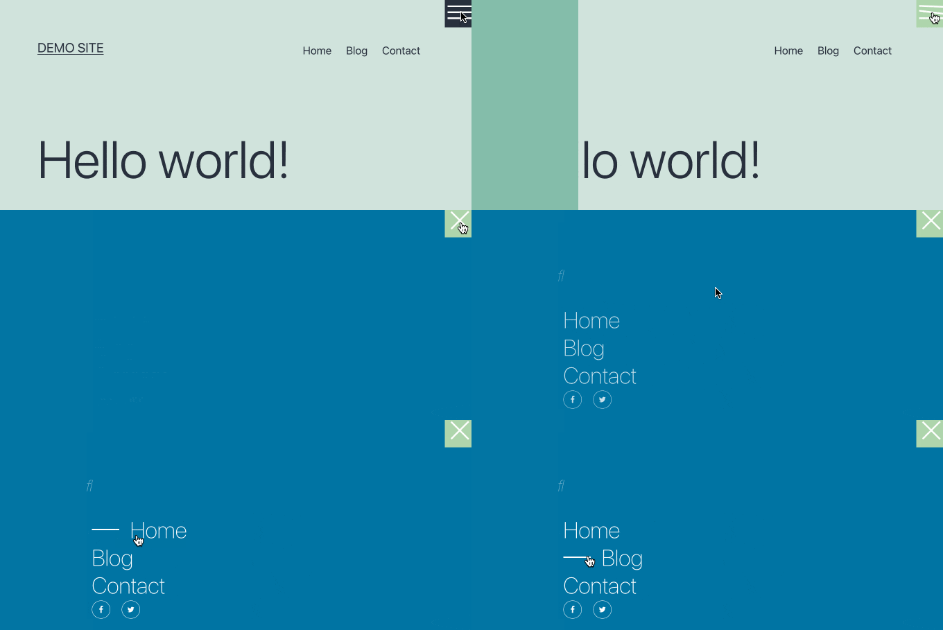
You can now visit your website to see the fullscreen responsive menu in action. We recommend that you resize your browser to see how the menu behaves on different screen sizes.
Here’s how it looks on our demo website.
Once you are happy with your fullscreen menu, don’t forget to navigate back to Fullscreen Menu Options in your WordPress admin menu and uncheck ‘Show only for admin users’.
After you click the ‘Save Changes’ button, visitors to your website will be able to access the menu.
Frequently Asked Questions About Adding a Fullscreen Responsive Menu in WordPress
Here are some questions that our readers have frequently asked about adding a fullscreen responsive menu in WordPress:
How do you create a responsive menu in WordPress?
To create a responsive menu in WordPress, use a mobile-friendly menu plugin like FullScreen Menu. This ensures your menu adapts to different screen sizes for smooth navigation.
How do you make a header responsive in WordPress?
Making a header responsive in WordPress means it adjusts automatically on any device. You can do this using a responsive theme or by customizing the header layout with CSS and the block editor.
For detailed instructions, see our tutorial on customizing your WordPress header.
How to make a full screen page in WordPress?
You can make a full screen page in WordPress by using a page builder like SeedProd or theme settings that allow “full-width” templates. This removes sidebars and stretches your content across the entire screen.
How to create a responsive table in WordPress?
To create a responsive table in WordPress, use the block editor’s table block or a plugin with responsive table support. This ensures your table scrolls or stacks neatly on mobile devices.
We hope this article helped you learn how to add a fullscreen responsive menu to your WordPress site. You may also want to learn how to add a mega menu on your WordPress website or how to add a slide panel menu in WordPress themes.
If you liked this article, then please subscribe to our YouTube Channel for WordPress video tutorials. You can also find us on Twitter and Facebook.




Mrteesurez
Does this support all themes, I mean if it can work on any theme or is theme specific ?
Also, can it accommodate search box like you have implemented it on your website ?
WPBeginner Comments
It should normally work with all themes unless the theme has a code issue or conflict.
Also, the plugin does have a Animated Search Bar feature that you may want to check out.
Andrew Peters
Hey guys!
I love how a lot of your posts have a Plugin option and then a manual tutorial as well. Is there a tutorial on how to manually add a menu like this to your child theme.
I’m using Beaver Builder child theme and trying to learn how to add an off canvas menu as a secondary menu option.