I’ve been doing popup marketing for over a decade now, and I’ve found that it is one of the most effective ways to prompt action and get more leads online.
It’s important to use psychological principles in your popups to grab attention and influence user behavior. This can help you create popups that offer real value to your visitors instead of annoying them.
Here are some of my favorite tactics and approaches that leverage the psychology of popups to increase signups by around 250%.
Note: This is a guest post by Thomas Griffin, the co-founder of OptinMonster, the #1 WordPress popup builder and lead generation plugin. This is an expert column that we publish every Thursday, where we invite a WordPress expert to share their experiences with our readers.
I will cover a few different topics in this post, and you can use the quick links below to navigate between the different sections:
- Optimize the Timing of Popups to Be Less Intrusive
- Personalize Your Popups Based on User Behavior
- Gain Users' Trust Using Social Proof
- Nudge Users Towards Action Using Scarcity and Urgency
- Build Anticipation Using the Fear of Missing Out (FOMO)
- Inspire Action by Using Emotional Appeal
- Use Color Psychology to Capture Attention
1. Optimize the Timing of Popups to Be Less Intrusive
Imagine walking into a physical store, and a salesperson immediately approaches you with suggestions about what to buy. They then continue to come back with more recommendations throughout your visit. Although they have good intentions, this may feel pushy and intrusive.
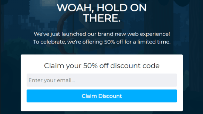
The same thing can happen with popups, but it doesn’t have to. Waiting until your visitors are ready before you display a popup with helpful content can improve the user experience and boost conversions.
This is a psychological principle known as ‘pattern interrupt’. An unexpected popup can disrupt the visitor’s flow and refocus their attention, similar to a salesperson approaching you in a store.
But for the popup to be welcomed, there needs to be a balance between being intrusive and providing helpful information. This makes the timing of popups critical.
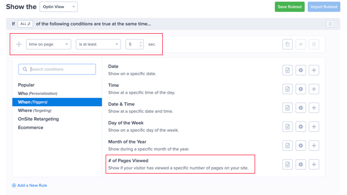
That’s why the best popup marketing software, including OptinMonster, will allow you to set powerful targeting rules. These rules enable you to show personalized campaigns to users based on a large set of triggers or conditions.
For example, time-based rules can display a popup after the user has spent some time on your WordPress website or on a specific page after they visit a certain number of web pages. Alternatively, a scroll distance rule can display a popup after the visitor has scrolled down the page a set distance.
OptinMonster can also use InactivitySensor to time when a user has been inactive, or Exit-Intent technology to sense the exact moment they are about to leave your website.
Using these strategies has allowed online businesses like Shockbyte to increase their signups by more than double, so it’s worth playing around with different timing rules to see what works for your business.
2. Personalize Your Popups Based on User Behavior
Studies show that 74% of your visitors expect personalized content, and it can boost conversions by 42%.
Personalization is an important psychological principle, and tailoring your popups to users’ interests and behavior patterns will make them more relevant and engaging.
The problem is that if you are using popups to collect leads, you don’t already have any personal information about your target visitors, which makes personalization challenging.
This is where personalized triggers can make a big difference.
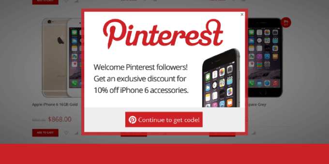
For example, OptinMonster’s referral detection feature can easily determine the domain from where each visitor visits your website. This allows you to display a custom popup if the user was referred to your site from another specific website.
Let’s say you’re getting a lot of Pinterest traffic. You could create a targeted popup that offers people a discount when they sign up for your newsletter.
You can also trigger a popup based on the specific page they are currently looking at. That page can give you a clue as to what the visitor is interested in and then show a popup related to the topic being discussed or the product being reviewed.
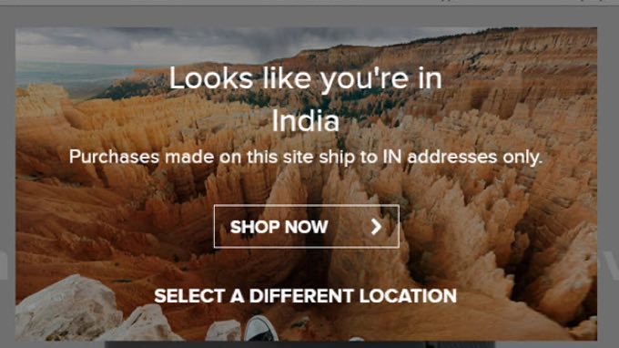
Another option is to personalize your content based on the visitor’s location. 80% of marketers use location-based personalization and get great results.
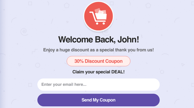
Once a user has signed up for your newsletter, you can offer even greater personalization. That’s because many popup software options have access to the personal data you have collected, such as the visitor’s name, gender, age, birthday, and more.
This means you can easily create more personal popups, such as mentioning the customer by name. You simply insert this information on your popup using smart tags.
On top of personalized triggers, I like to learn more about visitor behavior by tracking the user journey using an analytics plugin like MonsterInsights.
For example, you can see which pages a specific user views before filling out your signup form.
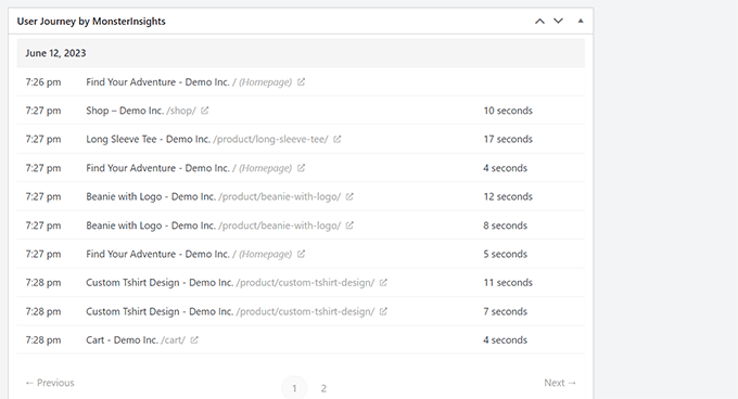
This will show you which form or web page inspires the most signups, how much time users spend on your website and how far they scroll down the page before signing up, as well as the amount of engagement your videos are getting.
You can then use this information when deciding where and when to display your popups and optimize your highest-performing pages to boost organic traffic and leads.
3. Gain User Trust Using Social Proof
When people are unsure what to do, they often follow the crowd. Social proof is a psychological phenomenon where people are more likely to take action if they see others doing it first. It’s like a shortcut their brains use to decide if something is good or not.
That’s why people are more likely to follow someone on Twitter who already has lots of followers, watch a movie that has good user reviews, or choose a restaurant with a long line of people waiting to get in rather than one that’s empty.
You can use social proof on website popups by including user testimonials. This can help build trust and credibility in a short amount of time, influencing users towards conversion.
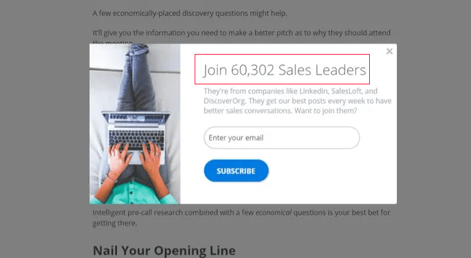
The simplest way to get started with social proof is to display the number of subscribers you already have. This is a quick way to lend credibility to your newsletter.
Another way you can use testimonials for social proof is influencer marketing. Including endorsements from celebrities and experts in your niche who use your products or subscribe to your newsletter can gain your users’ trust and grow your signups.
For example, Be A Better Blogger achieved a 26% conversion rate by featuring a celebrity testimonial in a popup.
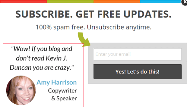
You could also display your social media statistics, list the awards and badges you have won, list the number of 5-star ratings you have, and more.
All of these strategies will show your visitors that other people are happy with your product or service, making them more likely to try it themselves.
4. Nudge Users Towards Action Using Scarcity and Urgency
Urgency and scarcity are two closely linked psychological principles that can be used in popups to nudge users toward a quicker decision.
Many of my clients with online stores like to create a sense of urgency with a limited-time discount. You can use the same strategy to boost your signups by offering a discount coupon or giveaway to new subscribers for a limited time.
You can place this information with a countdown timer in a popup to emphasize that time is running out. This is easily done in OptinMonster by adding a Countdown block to a time-sensitive offer popup, as you can see on the Kennedy Blue website.
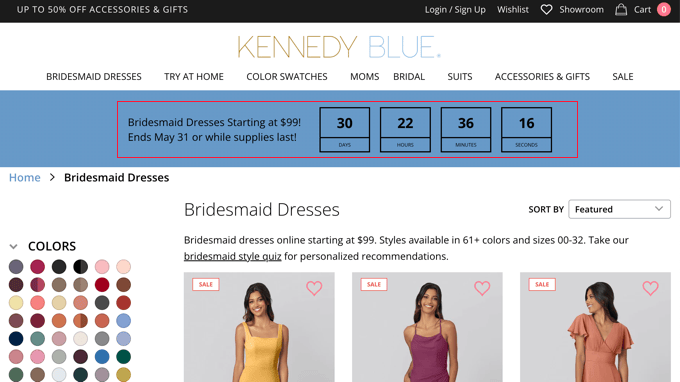
Typical examples of scarcity include products that are low in stock and limited edition products. To encourage newsletter signups, you could create a sense of scarcity by offering a lead magnet or other incentive to the first 100 or so users to subscribe.
Alternatively, you can offer special deals for new subscribers each month. Crossrope is a fitness company specializing in jump rope workouts, and they used this strategy successfully to explode their email list by 900%.
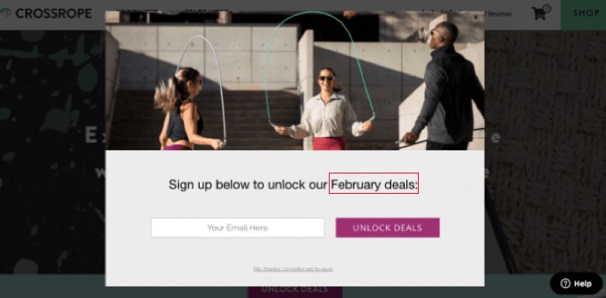
You can highlight the limited-time deal by using phrases like “Don’t miss out!” or “Last chance!” on your popups.
Remember, the key is to use urgency and scarcity ethically and authentically. For instance, never display fake countdown timers or mark an item as low stock when you have plenty.
5. Build Anticipation Using the Fear of Missing Out (FOMO)
Do you ever feel left out when other people are enjoying something exciting that you’re not? This is a psychological trigger known as FOMO, or the fear of missing out.
You can create a sense of FOMO using the strategies of urgency, scarcity, and social proof that we covered above. But that’s just the start.
Another way is to offer exclusive content that only email subscribers can access. This could be content on your website or downloadable content such as an ebook.
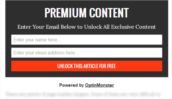
Content locking lets you blur or remove content below a set point on the page as you see above. Visitors have to opt in to see the rest of the article. Some of my customers have boosted conversions by 150% using this strategy.
You can also build anticipation by making your visitors aware of something that is not yet available, such as an upcoming product, a new ebook you are working on, or a webinar or training course. Let them know that they can stay updated by signing up for your mailing list.
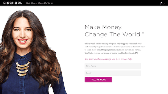
Marie Forleo builds anticipation on her website by promoting her flagship course, B-School. Although this course runs just once a year, Marie includes a notice on her website that visitors can subscribe to her email list so they stay in the loop and don’t miss out.
6. Inspire Action by Using Emotional Appeal
Popups that bring to mind positive emotions are more likely to resonate with users and have them respond to your call to action. You can appeal to strong emotions such as excitement, curiosity, aspiration, and humor.
Power words are persuasive words you can use in your popups to trigger a psychological or emotional response. They can entice your users to sign up and are one of the easiest ways to increase your conversion rates.
My team put together a helpful list of the best power words to use in your popups that can increase conversions by 12.7%.
Rich Page tested two different headlines in his popup, one that didn’t use power words and the one in the following screenshot that does.
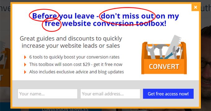
With the optimized popup that appealed to his visitors’ emotions, he increased his signup rate from 12% to 50%.
If you need help coming up with enticing content for your popup, then you can use OptinMonster’s Smart Optimizations feature to improve your existing copy using AI. It takes your text and asks ChatGPT to suggest improvements.
My team programmed the AI using our decades of experience creating successful OptinMonster campaigns so that these suggestions will have a higher chance of converting.
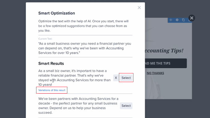
You can select one of the suggestions or ask for more variations.
Another way to appeal to users’ emotions is by using images. Placing a heart-melting photo like this on a popup can increase email signups by 63%.
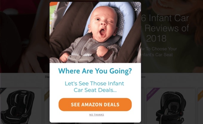
By strategically using emotional appeal and considering these points, you can create popups that connect with users on a deeper level, influence their decisions, and ultimately increase your conversion rates.
7. Use Color Psychology to Capture Attention
I came across a study that shows it takes just 90 seconds for someone to make a judgment about something they see, and 90% of that opinion is based on color.
Color psychology can be a powerful tool to grab attention and influence user behavior in your website popups, ultimately leading to more signups.
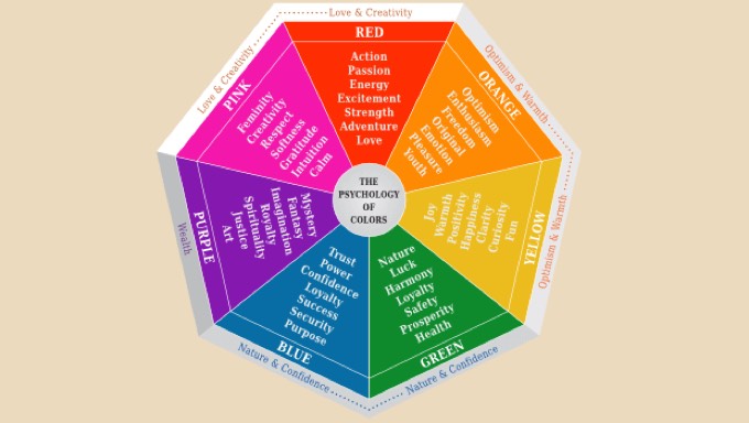
However, when I researched the best colors to use on popups, I found that the specific colors you use don’t have a major impact on conversions. Instead, the key thing is to choose button colors that are high-contrast, on-brand, and consistent.
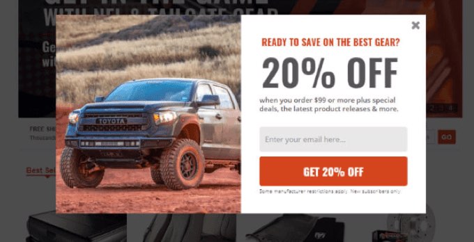
Speaking of buttons, you can increase your signups by 14.34% just by adding a call to action button to your popup. And you can increase that rate even more by using colors that make it easy for website visitors to find where they’re supposed to click.
Notice the contrasting color that AutoAnything uses on their CTA button. They were able to increase their daily email optins by 250% using this email subscription popup.
I hope this article helped you understand the psychology of popups and boost your signups. You may also want to read my last guest post on why popups continue to stay relevant and the best email marketing services for small business.
If you liked this article, then please subscribe to our YouTube Channel for WordPress video tutorials. You can also find us on Twitter and Facebook.



Syed Balkhi says
Hey WPBeginner readers,
Did you know you can win exciting prizes by commenting on WPBeginner?
Every month, our top blog commenters will win HUGE rewards, including premium WordPress plugin licenses and cash prizes.
You can get more details about the contest from here.
Start sharing your thoughts below to stand a chance to win!
Dennis Muthomi says
That section about personalizing popups is extremely gold.
Tailoring pop ups based on referral sources, pages viewed, and user data enables creating a customized experience that feels like it was designed just for each visitor will help boost engagement.
Thank you for sharing your expertise, Mr. Thomas!
I’ve LEARNED something new today
Dayo Olobayo says
I completely agree with your point about timing being crucial for popups. If a popup appears too early, it disrupts the user experience. But if it appears just as someone is about to leave, it can provide useful information without being intrusive. Balancing this timing is key to effective popup and I love that you mentioned optinmonster has that feature. Will definitely try them out.
Jiří Vaněk says
Optin Monster is great in that it has a lot of triggers. Not only in terms of time, but also on the amount of text read, on leaving the page and others. I have been using it for several months and it has helped me a lot in collecting addresses for the newsletter. Definitely try it. It’s a great plugin.
Jiří Vaněk says
I use popup windows on the website using the Optin Monster plugin and it helped me significantly increase the list of email addresses for the newsletter. I love popups and how they help me. Thanks Griffin for the really valuable advice and the plugin which is absolutely perfect.