Mobile navigation can make or break your WordPress site’s user experience. And at WPBeginner, we’ve discovered that the default mobile menu settings don’t always align with what our users want to achieve on their websites.
While WordPress themes do a good job of converting desktop menus into mobile-friendly versions, this automatic conversion isn’t always the best solution.
Our users often need to display different navigation options for their mobile visitors, whether for simplicity, special promotions, or improved conversion rates.
In this article, we will show you how to easily hide the default mobile menu in WordPress so you can show a custom menu instead.
We will cover two different methods in this tutorial, and you can use the quick links below to jump to the method you want to use:
Method 1: Hide a Mobile Menu in WordPress Using a Plugin
The easiest way to hide the mobile menu provided by your WordPress theme is by using the WP Mobile Menu plugin.
This plugin allows you to create a unique menu and then show it to mobile users. You can also hide the mobile menu that many themes provide by default.
Create Your Mobile Menu
First, you need to create the navigation menu that you want to show on mobile devices. To get started, head over to the Appearance » Menus page in your WordPress dashboard.
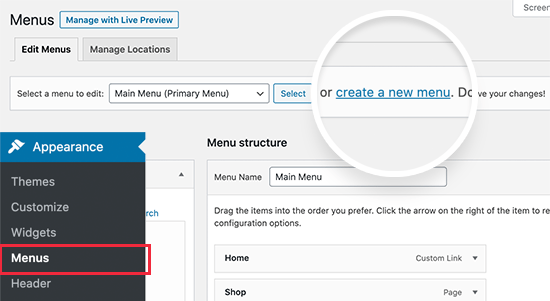
On the next screen, you need to type in a name for the menu. It’s a good idea to use something that will help you identify the menu later, such as ‘Mobile Menu’.
After that, you can select all the posts and pages you want to add to the mobile menu.
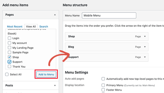
For more detailed instructions, see our guide on how to create a navigation menu in WordPress.
When you are happy with the menu’s layout, remember to click the ‘Save Menu’ button to save your changes.
Configure the Plugin Settings
With that done, it’s time to install and activate the WP Mobile Menu plugin. For more details, see our step-by-step guide on how to install a WordPress plugin.
Upon activation, head over to Mobile Menu Options to configure the plugin settings.
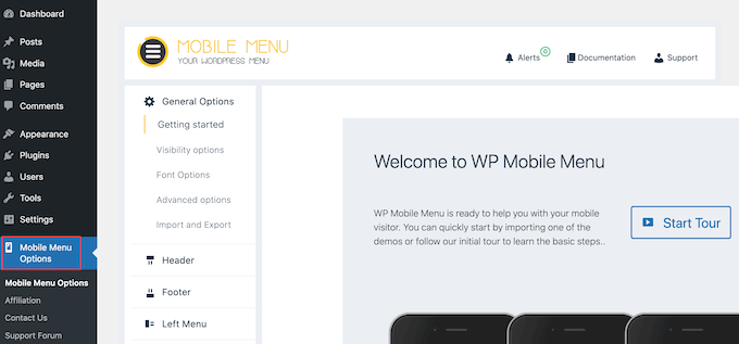
Here, you must scroll to the bottom of the page and choose whether to show the mobile menu on the left or right-hand side of the screen using the ‘Enable Left/Right Menu’ toggles.
Next, open the ‘Choose one menu’ dropdown and select the mobile menu you created earlier.
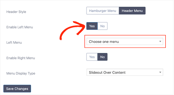
After that, simply click on ‘Save Changes.’
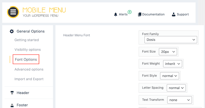
There are lots of ways to style your WordPress navigation menu. For example, you can select ‘Font Options’ and then change the font size, weight, spacing, and more.
You can also select ‘Header Style’ and change how the mobile header looks and acts.
For example, you can add a shadow, change the header height, create a sticky navigation menu, and more.
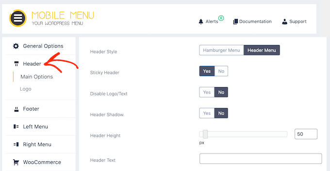
Most of these settings are straightforward, so you can look through them and see what different kinds of effects you can create. For example, you can add an image icon or add CSS to your WordPress menus.
When you are happy with how the mobile menu is set up, just click on ‘Save Changes.’
Add Your Mobile Menu to WordPress
Now that you have set up the plugin, the next step is telling WordPress where to show the mobile menu by going to Appearance » Menus.
If it isn’t already selected, then open the ‘Select a menu to edit’ dropdown and choose the mobile menu you created earlier.
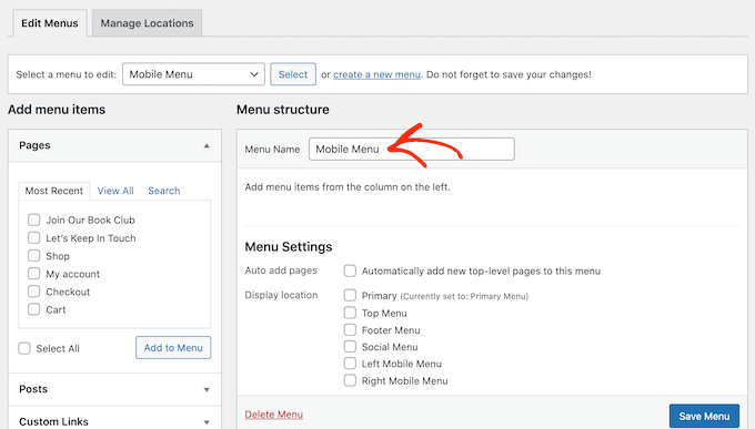
Then, under ‘Menu Settings’, you must select either ‘Left Mobile Menu’ or ‘Right Mobile Menu’, depending on where you want to show the menu.
After that, simply click on ‘Save Menu.’
Now, either visit your website on a mobile device or view the mobile version of your WordPress site from desktop. You should see the custom mobile menu.

Troubleshooting: How to Hide the Default Mobile Menu
By default, the plugin automatically hides menu elements used by most popular WordPress themes. This means your theme’s default mobile menu should be hidden without you needing to do anything.
However, if the default mobile menu is still appearing, then you will need to go to Mobile Menu Options » General Options » Visibility Options in the WordPress dashboard.
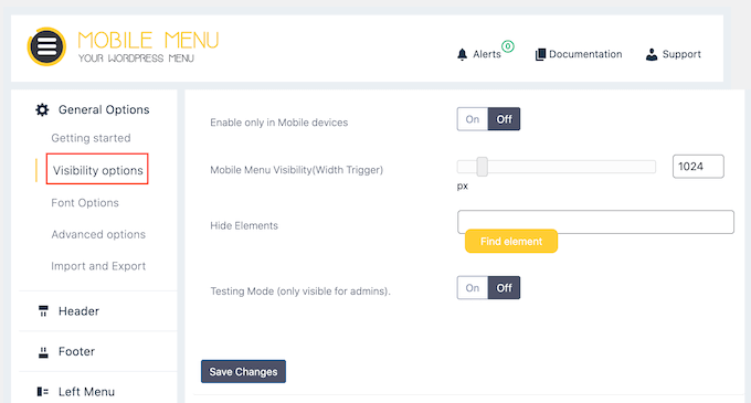
Here, click on the ‘Find Element’ button.
This opens a mobile version of your website.
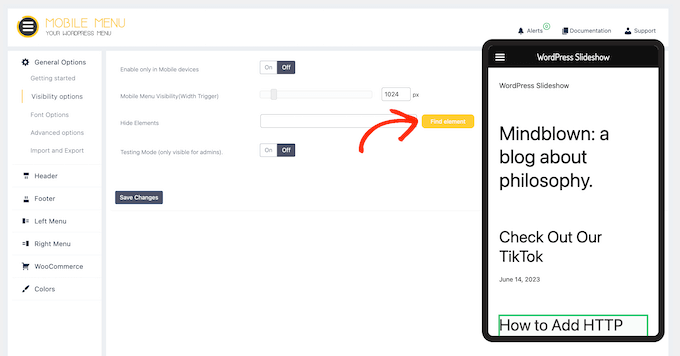
In this popup, click to select the content that you want to hide on mobile devices, such as the menu provided by your WordPress theme.
This adds the content’s CSS class to the ‘Hide Elements’ field.
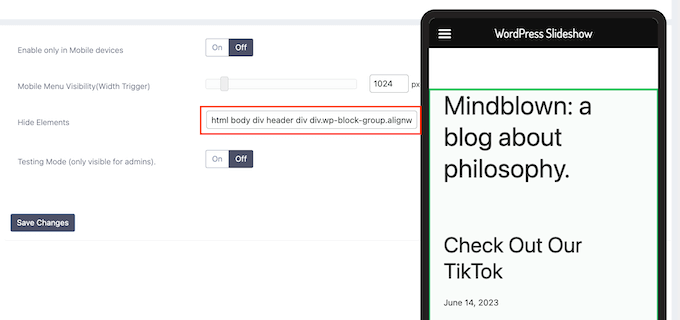
With that done, click on ‘Save Changes’. Now, the theme’s menu should no longer appear on mobile devices.
Method 2: Hide Mobile Menu Using CSS Code
This method is a bit advanced and requires you to add custom code to your website.
For this method, you can choose between two different approaches. You can hide the entire default mobile menu using CSS, or you can hide individual menu items on mobile devices.
1. Hiding a complete menu on mobile devices using CSS
One option is to completely remove the default mobile menu from your WordPress theme. This is a good choice if you want to use a different method of navigation on mobile, such as breadcrumb navigation links or interactive images.
First, you need to find the element that you need to modify. To do that, simply go to your WordPress website and hover the mouse over the navigation menu.
After that, right-click and select your browser’s Inspect tool.
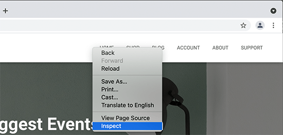
Your browser screen will now split into two, and you will see the page’s code, including the code for the navigation menu.
However, we don’t want to change this navigation menu since we can see it on the desktop screen.
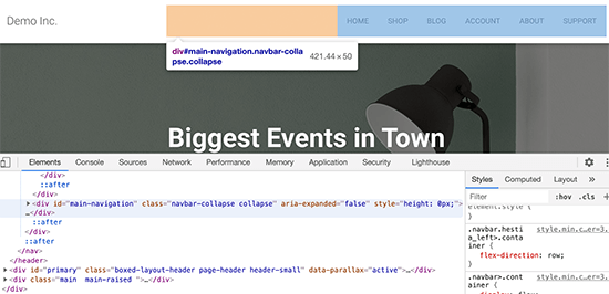
Thankfully, there’s an easy way to access the mobile menu instead.
Simply drag the corner of the browser to make it smaller until WordPress replaces the desktop navigation menu with the mobile menu.
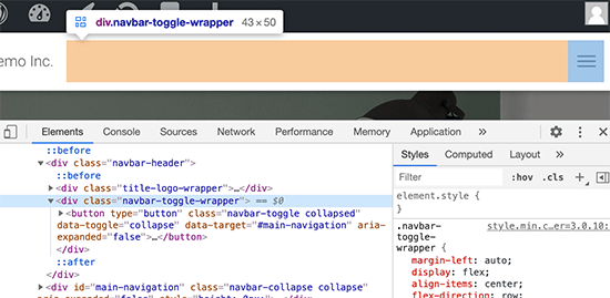
Now, you need to figure out the identifier and CSS class used by the mobile navigation menu. Simply move your mouse over the source code until your browser highlights the menu area. This section contains the class and identifier that you need to use.
Once you have this information, you can hide the menu on mobile devices using code.
Often, WordPress guides will ask you to add custom code to your functions.php file. However, this isn’t very user-friendly, and even a small mistake in the code can cause all sorts of common WordPress errors. The custom code may even completely break your website.
Instead, it’s safer to add custom code using WPCode.
This free plugin makes it easy to add custom CSS, PHP, HTML, and more to WordPress without putting your site at risk. You can simply paste the plugin’s code into WPCode’s editor, and then activate and deactivate the code with the click of a button.
To start, you will need to install and activate WPCode. For more information, see our step-by-step guide on how to install a WordPress plugin.
After that, go to Code Snippets » Add Snippet in the WordPress dashboard.
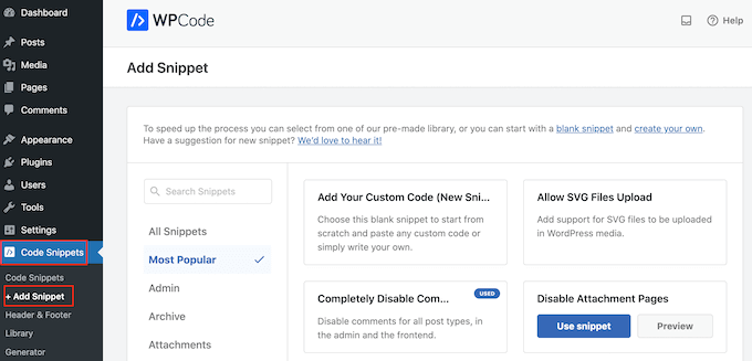
Here, you will see all the pre-made snippets you can add to your site. This includes a snippet that allows you to completely disable comments, upload file types that WordPress doesn’t usually support, disable attachment pages, and much more.
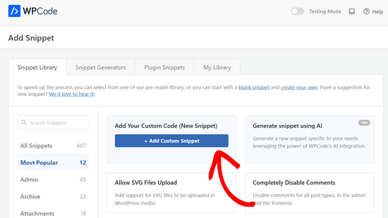
To add custom CSS to your site, just hover over ‘Add Your Custom Code’ and then click the ‘+ Add Custom Snippet’ button.
Then, select ‘CSS Snippet’ as the code type from the list of options that appear on the screen.
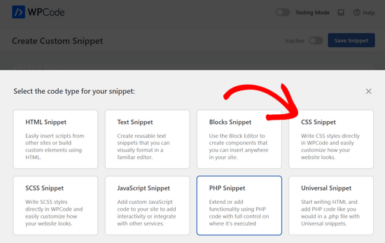
This will bring you to the Create Custom Snippet page.
To start, type in a title for the code snippet. This could be anything that helps you identify the snippet in your WordPress dashboard.
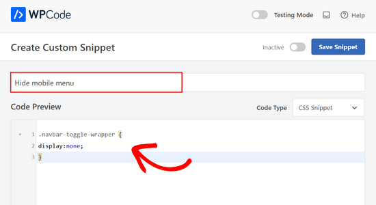
After that, you can paste or type the following code into the code editor:
.navbar-toggle-wrapper {
display:none;
}
Don’t forget to replace .navbar-toggle-wrapper with the identifier you found using your browser’s Inspect tool.
When you are ready to publish the code snippet, scroll to the top of the screen and click on the ‘Inactive’ toggle so it changes to ‘Active’.
Finally, click on ‘Save Snippet’ to make the snippet live.
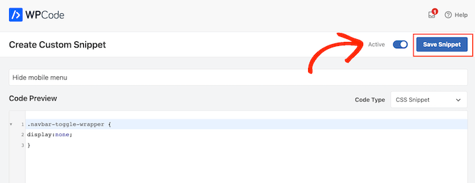
Now, your theme’s mobile menu will be hidden on smartphones and tablets.
2. Hiding specific menu items in mobile menu using CSS
This method allows you to create a navigation menu and then selectively show or hide items that you don’t want to appear on mobile or desktop devices.
In this way, you can use the same navigation menu for mobile and desktop visitors. First, go to Appearance » Menus.
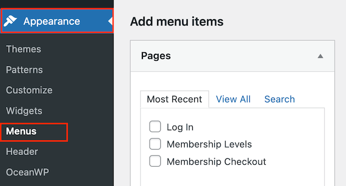
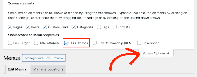
With that done, click on the ‘Screen Options’ button in the top right corner of the screen.
From here, you need to check the box next to the ‘CSS Classes’ option.
After that, scroll to a menu item that you want to hide on mobile and click to expand it.
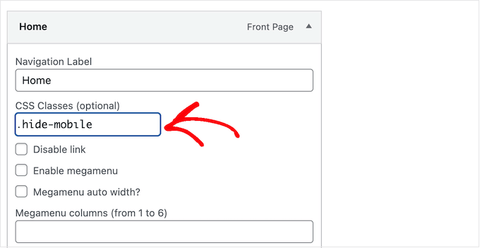
In the menu item settings, you will see the option to add a CSS class. Here, simply go ahead and add a .hide-mobile CSS class.
Repeat the process for all menu items that you want to hide on mobile.
Similarly, you can click on any menu items that you want to hide on desktop computers. However, this time, add the .hide-desktop CSS class instead.
When you’ve finished, don’t forget to click on the ‘Save Menu’ button to store your changes.
With that done, you are ready to hide these menu items using custom CSS. Simply create a new custom code snippet by following the same process described above.
Now, you can add the following CSS to the WPCode code editor:
@media (min-width: 980px){

    .hide-desktop{
    display: none !important;
    }

}

    @media (max-width: 980px){
    .hide-mobile{
    display: none !important;
    }

}
After that, simply publish the code snippet.
Now, if you visit your WordPress blog, you will see that the menu items you wanted to hide on desktop are no longer visible. To test how the menu looks on mobile, simply shrink the browser screen until WordPress switches to the mobile menu.
We hope this article helped you learn how to easily hide a mobile menu in WordPress. You may also want to see our expert picks for the best drag and drop WordPress page builders and our guide on how to add conditional logic to menus.
If you liked this article, then please subscribe to our YouTube Channel for WordPress video tutorials. You can also find us on Twitter and Facebook.


Ricardo Ideas
excelente, simple y efectiva, funciono perfecto, muchas gracias
Jiří Vaněk
I created a sliding menu according to your guide. I am familiar with the inspector, but sometimes it is challenging for me to navigate and find things in it. I followed your guide to find the CSS class. I eventually found it. The first attempt took quite a long time, but now I know how to do it, and any future searches will be much easier because I finally learned how to use and understand this tool better. As for browsers, Firefox made the search the easiest for me.