WordPress makes it easy to create engaging, multimedia pages by automatically embedding third-party content like YouTube videos and Tweets.
However, after working closely with WordPress users for the past 15+ years, a lesson we learned is that oEmbeds can also cause problems. Imagine a YouTube video overflowing its container and pushing all your text to the side, or forcing your call to action button further down the screen.
That’s where setting a maximum width for oEmbeds comes in. It allows you to take control and ensure your embedded content fits seamlessly with your website’s design.
In this article, we will show you how to set oEmbed max width in WordPress so you have complete control over your site layout.

Why Fix the OEmbed Maximum Width in WordPress?
WordPress supports oEmbed, which allows you to automatically embed content from third-party websites. For example, you can easily embed YouTube videos, SlideShare presentations, tweets, and many other types of content.
This content isn’t hosted on your server, so it won’t slow down your website. In particular, you should always use technologies such as oEmbed, and never upload a video to WordPress.
Note: Although Facebook and Instagram both supported oEmbed in the past, Meta has since dropped support for oEmbed. For step-by-step instructions on how to repair this feature, please see our guide on how to fix the Facebook and Instagram oEmbed issue in WordPress.
WordPress will always try to adjust the width of embedded content so that it perfectly fits the available space. However, sometimes the embedded content may be too wide and overlap your website’s other content areas.
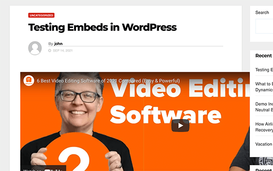
Unfortunately, you can’t set a maximum width for third-party embeds using the built-in WordPress tools.
That being said, let’s see how you can add this missing feature and set a maximum oEmbed width in WordPress. Simply use the quick links below to jump straight to the method you want to use:
- Method 1: Using the Embed Shortcode (Best for YouTube Videos)
- Method 2: Using the Built-in WordPress Embed Blocks (Easy)
- Method 3: Using Custom PHP (Set a Max Width for All Embeds)
- Method 4: Using CSS (Set Max Width for Specific Embed Types)
- Bonus Tip: How to Easily Add Your Social Media Feeds to WordPress
Method 1: Using the Embed Shortcode (Best for YouTube Videos)
You can set a maximum width using a shortcode. This method is easy, particularly if you only want to set the maximum width for a small number of posts. We’ve also found that this method works well for embedding videos in WordPress blog posts.
However, the embed shortcode and its width and height parameters don’t work for all oEmbed providers. For example, you can’t use it to set the height and width of a Giphy embed in WordPress. In that case, you can try one of the other methods mentioned below.
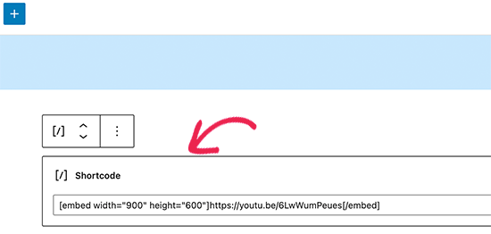
Instead of pasting the URL into the post editor, you’ll need to create a shortcode block. You can then add width and height parameters to the embed code.
For example, you simply need to wrap the following in embed tags:
width="900" height="600"]https://www.youtube.com/watch?v=6LwWumPeues
Just change the width and height values to suit your own needs and replace the URL with the content you want to embed.
When you are happy with the page, just click on either ‘Update’ or ‘Publish.’
The embedded content should now fit neatly into the available space.

Method 2: Using the Built-in WordPress Embed Blocks (Easy)
The WordPress block editor comes with several embed blocks for different oEmbed services, such as blocks for Twitter, YouTube livestreams and videos, and SoundCloud embeds.

Some of these blocks allow you to change the alignment of the embed and set the content to ‘Wide width’ or ‘Full width.’
If you choose full width, then the embed block and the embedded content will take up the full width of the screen. If you choose wide width, then the embed block will take up the entire width, but the content will remain the same size.
The end result may vary depending on your WordPress theme. However, this is a quick and easy method, so it’s worth seeing if it works for your WordPress website.
Simply click on the ‘Align’ button in the small toolbar above the block. Then, select either ‘Wide width’ or ‘Full width.’
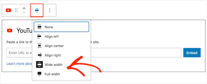
If this fixes the maximum width issue for the embed, then you can go ahead and publish the page. If you are not happy with how it looks, then you’ll need to try a different method.
Method 3: Using Custom PHP (Set a Max Width for All Embeds)
Sometimes you may want to set a maximum width for all embedded content. The easiest way to do this is by adding custom code to your WordPress website.
The problem with this method is that the maximum width attribute will only work if the embedded content doesn’t already have a ‘width’ defined. If the embed code already includes its own ‘width’ attribute, then this method may not work.
If you haven’t edited your site’s code before, then take a look at our guide on how to easily add custom code snippets in WordPress.
Some guides ask you to edit the theme files manually, but this can cause all kinds of errors and may even completely break your website.
For that reason, we recommend using WPCode. It makes it easy to add code snippets in WordPress without having to edit your theme files. That way, you can update or change your theme without losing all your custom code functions.
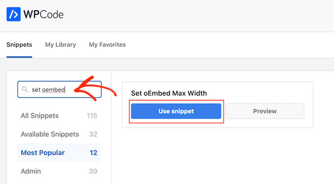
WPCode also comes with a library of pre-configured code snippets, which includes a ‘Set oEmbed Max Width’ snippet. This allows you to specify a maximum width and height for your oEmbeds.
First, you will need to install and activate the free WPCode plugin. For more information, see our step-by-step guide on how to install a WordPress plugin.
Upon activation, navigate to Code Snippets » Library in your WordPress admin panel.
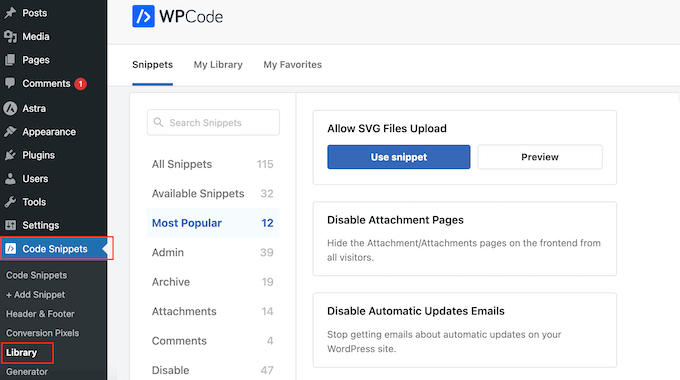
Here, you can search for ‘Set oEmbed Max Width’ and hover your mouse over the result named the same thing.
You can then click on ‘Use Snippet.’
WPCode will then take you to the ‘Edit Snippet’ page, where the plugin has already configured everything for you.
Here, you’ll notice the following ready-made code snippet:
function wpcode_snippet_oembed_defaults( $sizes ) {
	return array(
		'width'  => 400,
		'height' => 280,
	);
}

add_filter( 'embed_defaults', 'wpcode_snippet_oembed_defaults' );
By default, this sets the maximum width to ‘400’ and the maximum height to ‘280.’ Don’t forget to adjust the height and width attributes to suit your needs.
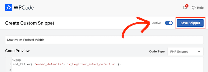
Finally, click on the ‘Inactive’ slider so that it shows ‘Active.’ Then just click the ‘Save Snippet’ or ‘Update’ button to make the code snippet live.
Method 4: Using CSS (Set Max Width for Specific Embed Types)
By default, WordPress automatically adds CSS classes to different areas of your site.
It also adds several CSS classes to embed blocks. You can use these CSS classes to set a maximum width for embeds on your WordPress blog.
This is a good choice if you want to set a maximum size for a specific type of embed, such as embedded Tweets. It also allows you to create a maximum size for all embedded content, regardless of type.
To find out which CSS classes you need to target, simply embed content in a post or page and then preview it in your browser.
Then, hover your mouse over the embedded content and right-click. In the menu that appears, select the ‘Inspect’ tool.

This opens a new panel showing all the CSS classes WordPress added to the embedded content. You can use these classes to set a maximum width for this type of embed.
To target a specific oEmbed provider, you’ll typically use .wp-block-embed-providername, so look for this class in the panel.
For example, in the following image, we’ve underlined the .wp-block-embed-providername class. On this line, we can also see a .wp-block-embed-pinterest class.
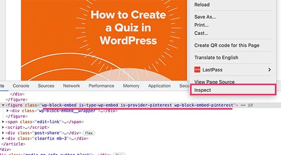
You can set a maximum width for Pinterest embeds only using the .wp-block-embed-pinterest class.
For example:
.wp-block-embed-pinterest {
    max-width: 900px!important;
}
Just be aware you may need to replace .wp-block-embed-pinterest with a different CSS class, depending on the content you want to target.
If you want to set a maximum width for all embeds, then you can use the following snippet:
.wp-block-embed {
    max-width: 900px!important;
}
The easiest way to add custom CSS to your website is by using WPCode. Simply create a new custom snippet following the same process described above.
However, this time open the ‘Code Type’ dropdown and select ‘CSS Snippet.’
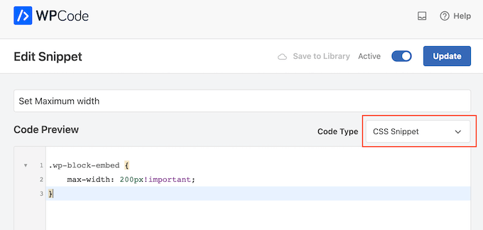
You can now save and publish this snippet in exactly the same way you make any WPCode snippet live.
With that done, WordPress will use this value as the maximum size for your embeds.
Bonus Tip: How to Easily Add Your Social Media Feeds to WordPress
If you regularly embed content from social media platforms, then you can save a lot of time and effort by using Smash Balloon.
Smash Balloon is the best social media plugin for WordPress and allows you to easily add your social media feeds to a WordPress website.
It supports all of the popular social media embeds, including YouTube, Twitter, Instagram, and TikTok videos.
More importantly, Smash Balloon is mobile-responsive and works with any WordPress theme, so your embedded content will always look great.

We hope this article helped you learn how to set an oEmbed max width in WordPress. You may also want to see our guide on how to easily embed iFrame code in WordPress, or our expert comparison of the best live chat software for small business.
If you liked this article, then please subscribe to our YouTube Channel for WordPress video tutorials. You can also find us on Twitter and Facebook.


Syed Balkhi says
Hey WPBeginner readers,
Did you know you can win exciting prizes by commenting on WPBeginner?
Every month, our top blog commenters will win HUGE rewards, including premium WordPress plugin licenses and cash prizes.
You can get more details about the contest from here.
Start sharing your thoughts below to stand a chance to win!
Andreu says
The problem of this is that it makes the max width of the images also to the size defined. What can I do if I want to limit the embed width in the editor but not the image one? Thanks
Joe Daniel says
Thank you. I’ve been struggling with this for weeks… works for WP 4.0 with Genesis theme
digg says
Hi, it works perfectly for me.
But this affects to the overall site, which have different widths since there are full-width pages, with sidebars, or forums, etc.
Is it possible to discriminate this to affect only bbpress forum’s pages?
It will be very useful, thanks!
Ajit Kumar says
For anybody who can’t get this working or if Youtube videos and other iframe content are not getting resized, you will need to add the following code to your style.css
/* Make sure embeds and iframes fit their containers */
embed,
iframe,
object {
max-width: 100%;
}
Hope this helps. And Syed, thanks for the great post!
Waymond says
Thanks for posting the solution!
Abhishek Sachan says
not working
Dj says
THANKS! This was driving me crazy.
Anto (@imanto) says
You can’t use iframe, object, embed { max-width: 100%; height:auto;} yes it gets the width correct and makes the video responsive, but it doesnt fix the height when viewing in the browser.
Is there actually a way to do this? Ive tried pretty much everything, even fitvids dont work because you are setting a px base width in the functions, but it shows that width on mobile, then when you try to correct that with max-width, the height messes up even in the browser….
im thinking media queries or something? ugh im beat.
Amir says
Works perfect, thanks a lot!
Pierre Dickinson says
Hi, thanks for the tip, but it doesn’t work, here’s what you need in your function.php file :
add_filter(’embed_defaults’,’yourthemename_embed_defaults’);
function yourthemename_embed_defaults($defaults) {
$defaults[‘width’]=600; // or whatever you want
$defaults[‘height’]=360; // or whatever you want
return $defaults;
}
it works great!
Regards,
Filip Kojic says
This code doesnt work well. I put my theme name and theme just blocks.
Valerie says
Not sure if the other commenter realized it, but the code has curly quotes and would break a site. Gonna test here to see if shortcode wrappers will prevent the change that broke the code…
add_filter('embed_defaults','yourthemename_embed_defaults');John Cronin says
I am attempting to post a high-end animation film from YouTube to my WordPress blog. The bottom of the frame is cut off in the preview. Once the play arrow is clicked, this problem goes away. But the filmmaker is rightfully unhappy that the preview in the post will give the appearance of an error. Adjusting height and width in the post code works, but does not solve the problem. Ideas?
Colin says
Worked like a charm – thanks!
Ryan Silver says
Hi there,
I used your solution for width and it worked great. But how do I set the height now? Is it just the same if ( ! isset( $content_width ) ) $content_width = 560; but with the word ‘width’ is replaced with the word ‘height’ ? I tried that and it did not work….
Editorial Staff says
The height is auto-determined to match the 16:9 ratio.
Admin
FIlip Kojic says
It looks like it is 16:10. Here is example:
How can I change height. Please someone answer.
Jasmine Ham says
greats, it’s working! but what if i need it to be responsive?
any idea to doing that?
josef says
hi,
is there a way to force all ifreams in the site to be 100% widht. not omly youtube
i have about 300 ifreams and all fixed size so… thanks in advance
Josef
josef says
hi,
is there a way to force all ifreams in the site to be 100% widht. not omly youtube
i have about 300 ifreams and all fixed size so…
Ryan says
I added this code to my functions.php but it made no difference, and I assume that’s because my theme doesn’t define $content_width.
I see the link to the codex about defining it, but I’m not a developer and don’t have one on call; how does one add a $content_width definition to a theme? Where does it go? Thanks!
Justin Germino says
This worked perfectly, is there anyway to force and default the video to HD quality instead of SD quality which seems to be the default even though in my YouTube settings I have it set to default to HD?
Editorial Staff says
What is your max width? I have read in the past that Youtube adjusts quality based on the width of the iframe.
Admin
Grant Norwood says
Please note that the $content_width variable must be declared as global before this fix will work.
Nigel Parry says
WP seems to be updated by people who are unclear about the centrality of multimedia on the Internet. Why this basic preference would have to require code intervention I don’t know. WP clearly could not tell how wide my columns were. Anyway, all fixed now. You folks rock.
Editorial Staff says
Well Nigel, there is more to it. They are trying to make WordPress easier to use for “users”. Overtime, WordPress has added one option after another. This gets really terrifying for new users. This is why they are going with decisions over options route. The hope with this oEmbed max width is that each theme designer should/will define it in their themes, so the end-user doesn’t have to worry about it.
Admin
Alex Leonard says
Thanks! I was a little baffled as to where the media embed setting had gone to!
Azad says
Hello
Thanks for your post.
But I can’t get this right, I wrote the other post you mentioned in the comments. But I still can’t get it working, I put this:
At the begginin of my functions.php, but then my whole site stoped working. everything turned white, I had to edit the file through ftp to get it working again.
What am I doing wrong?
Thanks!
Azad says
Hey
I got it working, thanks!
Monica says
Hi, where in the functions.php file should this code be placed?
Editorial Staff says
You can paste it in the beginning or at the end as long as it is independent of other functions. Here is an article on that:
https://www.wpbeginner.com/beginners-guide/beginners-guide-to-pasting-snippets-from-the-web-into-wordpress/
Admin
Jesse Garnier says
What value would be appropriate for $content_width for a variable-width or responsive design?
Editorial Staff says
For responsive design, you probably want to use fitvid.js or something similar to resize your videos.
Admin
Paul Lumsdaine says
I was able to kind of get the responsiveness to work with setting a max-width: 100% on my iframes in CSS. Of course the height is set automatically depending on your content width but this should at least get it working correctly without using any extra js. Fitvid is the way to go, but this worked for me.
Jeremy Myers says
Paul,
Can you include the css you used to set your iframe width to 100%?
Roman says
I use this CSS code for responsive design:
iframe, object, embed { max-width: 100%; } ( if you want you can add -> height: auto )
Tevya says
Unfortunately Roman’s CSS either doesn’t work on some themes or doesn’t work with the new WP 3.6 media player that’s built-in to core. I just tried it and nothing. I’m trying to get a theme that’s responsive to keep the new WP 3.6 player responsive as well, but no luck so far. The 2012 theme seems to handle it very nicely, but I can’t figure out what they’re doing different than this theme I’m working with.
Melanie says
I am a novice to WP & coding, with that said not sure where to put the code “if ( ! isset( $content_width ) ) $content_width = 600;” I went to the function.php file in my Suffusion theme and not sure where exactly to insert this code. I tried a number of places where it mentioned video attachment and it is not working. In my case, the embedded videos are now too big for my theme since upgrading to WP 3.5.
Editorial Staff says
Change the number 600 to match your theme size. If it is too big for your theme, then make it smaller.
Admin
Jessi Linh says
It’s been released at right time!!! The name “Elvin” is so special,too.
Thanks for your post.
Edward Caissie says
This is part of the reason setting an appropriate $content_width value is a requirement under the WordPress Theme Review guidelines (http://codex.wordpress.org/Theme_Review#Required_Hooks_and_Navigation)
Editorial Staff says
Yup, totally agreed with you there. Only poorly coded themes will not have that. But there are a lot of those out there. A theme that one of our clients was using had that piece missing. Overall, its a good theme.
Admin
Devin says
Perfect timing. Thank you!