Are you having a hard time deciding on your website’s color scheme?
Choosing the right color combination can boost your website’s appeal, improving the user experience and increasing your sales and conversions.
In this article, we will show you how to easily choose a perfect color scheme for your WordPress site.
Understanding the Psychology of Colors
It’s a well-researched theory that colors can affect human responses. Colors have an emotional pull on the decisions and choices we make in our everyday lives. This is called color psychology.
Large corporations spend millions of dollars building a well-crafted brand image and identity for their products. They hire experts to pick just the perfect combination of colors for their brands, products, and websites.
The colors you use for your WordPress blog are an important part of your brand image, as they can create emotions and feelings in your users.
By using complementary colors strategically, you can create a memorable identity for your brand that resonates with its target audience. This can also establish trust between you and your customers.
So, how do you figure out which colors to use and which emotions you want to create in your users?
Lucky for you, marketers and psychologists have done plenty of research already.
For example, many food blogs and restaurants use the colors red, orange, or yellow because they are associated with hunger. Red is an attention-grabbing color, while yellow and orange stimulate excitement, creating a warm and welcoming atmosphere.
Similarly, most banks use the color blue as it signifies trust, calmness, and reliability.
For a further understanding of colors and their meanings, you may want to look at this infographic:

- Red: The color of youth and joy. It reflects boldness and confidence.
- Green: Creates a soothing, calming effect. It evokes a peaceful, progressive, and calm emotional response.
- Blue: It reflects trust, strength, and reliability.
- Black: Generates a sophisticated, solid, secure emotional response.
- White: Clarity and simplicity are the two major effects of white.
- Yellow: The color of optimism, warmth, and friendliness.
- Orange: Creates a fun, friendly, confident, and cheerful effect.
- Pink: Sensuality, femininity, romance, and love are the emotions associated with pink.
Other Things to Consider When Choosing a Color Scheme for WordPress
Colors need context to work the way you want them to work. Your brand or product may already have certain associations that may or may not work with the colors you are choosing.
There are a few things you should consider before picking a color scheme for your WordPress website.
First, you must consider the existing brand image. If you already have a logo and other marketing materials, then you may want to use the existing colors on your website.
You also need to consider which colors will look good for the website design.
For example, a bright blue color option may look great in person but might not be the best background color on your screen.
You also have to think about other media, like sliders, videos, images, and call-to-action buttons that you will be adding to your site. Make sure to choose a background that complements the colors you are using for your CTA button, text color, and sliders.
Finally, you should also keep accessibility in mind. A good color scheme has enough contrast that it’s easy to read even if your visitors have visual impairments, which many people around the world do.
For further instructions, you may want to see our beginner’s guide to improving accessibility on your WordPress site.
Video Tutorial
If you prefer written instructions or need more details, then continue reading.
Creating a Color Scheme for WordPress
Once you have chosen the appropriate colors for your WordPress website, there are several online tools that you can use to generate an unlimited number of color palettes.
We recommend you choose at least two colors that represent your brand and the response you want to get from users.
That being said, let’s take a look at the online tools you can use to generate the right color scheme for your site.
1. Adobe Color CC
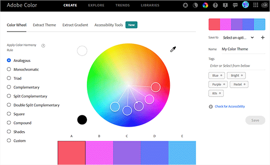
Adobe Color CC, formerly known as Kuler, is a great tool to generate color palettes.
The tool features a color wheel that can be used to choose colors from a spectrum. You can even select color rules before spinning the wheel to create visually pleasing color schemes. These rules include complementary, triadic, analogous, and monochromatic.
Additionally, you can manually adjust each color in the palette, and the rest of the colors will automatically change to match the color rule. You can also generate color palettes by uploading photos and extracting different colors from them.
Other than that, Adobe Color CC also offers a large library that you can use to select pre-made color schemes.
2. PHOTOCOPA by COLOURLovers
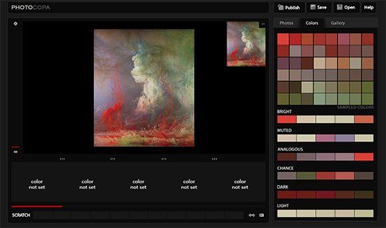
COLOURLovers is one of the most popular destinations for color inspiration and ideas. They have some great tools to generate color schemes. One of them is PHOTOCOPA, which allows you to design a color scheme from photos.
The tool lets you upload a photo and uses a color picker to select specific colors from the image to create a palette.
You can also use tools like COPASO by COLOURlovers to generate more advanced website color palettes from scratch or by using existing palettes uploaded by other users.
3. Material Palette
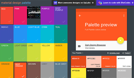
Inspired by Google’s Material Design concept, Material Palette is an online tool that allows you to generate color schemes using design rules.
It includes around 19 primary colors and their shades, along with a color picker tool that helps users select any hue, saturation, and brightness for the palette.
It offers pre-made color schemes and even lets you create custom colors by inputting the RGB or HEX codes.
Plus, the Material Palette also enables you to preview color palette designs on a website or mobile device interface in real time.
4. Coolors
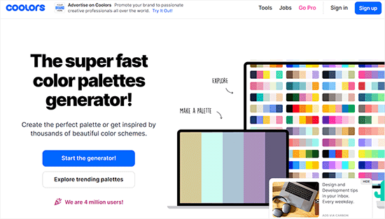
Coolors is a well-known color scheme generator that creates a color scheme based on the user’s choice, such as monochromatic, analogous, triadic, complementary, and others.
The tool lets you create a gradient between two colors. It even comes with a contrast checker that provides suggestions for making the palette more accessible for users with visual impairments.
It can also integrate with popular design tools such as Sketch, Photoshop, and Illustrator to create a color scheme.
With Coolor, you can also save, export, and share your color palettes with other users on the internet.
Bonus: Change the Admin Color Scheme in WordPress
Apart from creating an attractive color scheme for your site, you can also change the admin color scheme to create a custom WordPress dashboard for you and your team.
For example, if you run a restaurant and accept online orders for it, then you may want to use colors like red, yellow, or orange on the WordPress backend to represent your website.
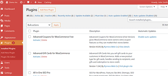
Similarly, if you have a membership site where users can log in to your WordPress dashboard, then you can use an attractive color scheme to enhance the user experience.
You can easily change the color scheme for your admin area by visiting the Users » Profile page from the WordPress dashboard.
After that, scroll down to the ‘Admin Color Scheme’ section and choose any of the 9 premade schemes for your website.
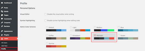
Once you have done that, don’t forget to click the ‘Update Profile’ button to store your settings.
For detailed instructions, see our tutorial on how to change the admin color scheme in WordPress.
We hope this article helped you learn how to choose the perfect color scheme for your WordPress site. You may also want to check our beginner’s guide on how to customize colors on your WordPress website and our expert picks for the best free WordPress blog themes.
If you liked this article, then please subscribe to our YouTube Channel for WordPress video tutorials. You can also find us on Twitter and Facebook.


Syed Balkhi says
Hey WPBeginner readers,
Did you know you can win exciting prizes by commenting on WPBeginner?
Every month, our top blog commenters will win HUGE rewards, including premium WordPress plugin licenses and cash prizes.
You can get more details about the contest from here.
Start sharing your thoughts below to stand a chance to win!
Dennis Muthomi says
I personally use a tool called Realtime Colors to help me out. It’s got a simple interface that lets you see how different color palettes would actually look on a real website. Makes it way easier to visualize and experiment with different options.
definitely recommend checking it out if you’re struggling with finding the perfect colors for your site
THANKGOD JONATHAN says
Color scheme is very important to match with any website design. Please how can I change the text color of my blog posts and pages? The theme I am using doesn’t have it in the “Customize”
WPBeginner Support says
Our guide below covers a few different options you can use
https://www.wpbeginner.com/wp-tutorials/how-to-change-the-text-color-in-wordpress-easy-methods/
Admin
Moinuddin Waheed says
Having a good color combination for any website gives a sense of consistency and branding.
I have noticed wpbeginner, there is consistent color every where and it gives a sense of branding.
I have used coolers for my websites to get a color combination.
Thanks for giving all the lists of possible options to explore color scheme for a websites.
WPBeginner Support says
Glad we could help share some color theory
Admin
Andy says
Hey everyone! I really wanted to make my site by myself – taking into account my preferences. But I also wanted the design of my site to appeal to visitors. I have tried many patterns and combinations. Thanks for your advice guys! With this article, I found a solution that I really like!
WPBeginner Support says
Glad you found our recommendations helpful
Admin
Rudy SMT says
Thanks for the article, I took the psychology of colors to heart.
I just complete the recoloring of my website, I didn’t use professional software like Adobe or PhotoShop but instead an online palette generator and some other trick.
I wrote down step by step how I picked the color and implemented on my website in less than 20 minutes without any professional design software.
i love to keep things simple; I hope it will help others.
filzakhan says
its awesome themes collection . verry nice and really funky coloring .. and i love it
Donnamarie says
Thank you for the color theory and tools! I’m about to create my first website and really want to use a black background with pastel colored, not white, fonts. I prefer this schemata because it’s way easier on my eyes with the reduced glare. I’ve been using the net for almost 20 years and see very few sites with dark backgrounds. Some white font on black is fine, but pages of it is too much contrast for me too. I’ve noticed a trend of light grey font on white backgrounds and when I see a site with that scheme, I bounce because it’s too straining to read. I’d love comments on the following 2 questions:
Does using a dark background really turn off the majority of potential subscribers?
I’ve heard that most webpages are white because at first they were emulating books…why is the majority of pages white?
Bryce Munger says
One thing to consider with sites is how they will look to everyone. I am red/green colorblind and what looks sharp and crisp to you may drive my eyes bonkers. The same applies in reverse, a combo I like may not look good to others. I would recommend finding some friends or associates that are colorblind (or vice verse) and have them review your work.
WPBeginner Support says
That’s a great tip Bryce, thanks for sharing.
Admin
Muhammad Imran says
Very nice collection and great free resources.Thanks
ميسرة says
Thanks wpbeginner stuff
Adrienne says
Good stuff! Color and how you use it is everything.
Melanie Lewis says
Great resource!!! Thanks so much!